Monday, 29 April 2019

Business cards research

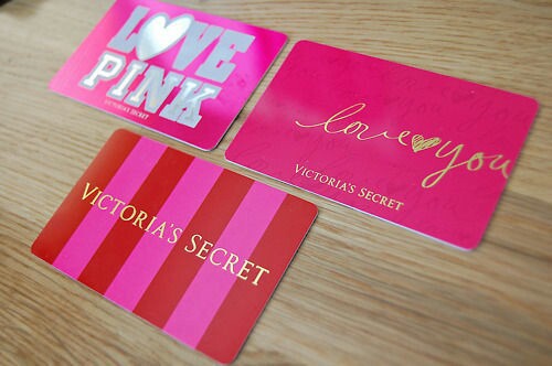
Below are the images I sourced of relevant companies business cards and some voucher cards as they are a similar style. Something that I have noticed from all the research gathered is that a lot of the cards have tacky images of women in lingerie which is something that I definitely want to steer away from this.

There are also a few designs that are not very sophisticated and a touch childish which is opposite of what the client asked for.  


Monday, 22 April 2019

Fred Aldous (riso print) communication for print


About a month ago I enquired about how to send Fred Aldous the documents in order to print my risograph print. It took a while to get my head around the different documents and the greyscale aspect however I got there in the end trying to work out the documents as they have to be in black and white or greyscale and have to set it to how you want it. 

I sent him : 


Blue: 


Red :


Black :


Overall :


He replied the next day :


Attachment :


He was so lovely about it and was understanding. The branches being that prominent really did take away the delicacy of the whole design so I am so pleased he replied quickly and nicely. 

Looking at the type in the right hand corner I played around with the idea of keeping it like that as it was something that I had researched into - the overlapping colours, however I moved away from this idea originally as it was more edgy and intense for the delicate look that I wanted to go for. 

So I made the changes that were necessary in order to create the look that I wanted in the 'final' image I sent to him and sent it back :

Black, Blue and Red :


He then replied: 


The red was the main focus, I decided to have the main body of red at 70% and the flowers that are 'falling' off the tree at 65% so they were a touch lighter to give the sense of air and lightness about them.

Crit


This is the design that I will show to more of my peers to gather some final feedback before sending it off to the riso printer.


Feedback -

- the top right text looks good as an overlay however the typeface might be too harsh for the design as the rest is delicate
- the text on the left of the print may be a little close to the red mount fuji line