Thursday 22 December 2016

STUDY TASK 3 - BLACKLETTER


Blackletter also known as Gothic scriptGothic minuscule, or Textura, was a script used throughout Western Europe from approximately 1150 to well into the 17th century. When using blackletter you do mostly vertical strokes, use small gaps, smooth curves, sharp, straight and angular lines.

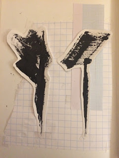
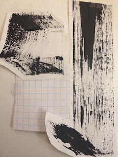
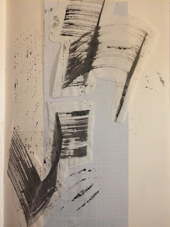
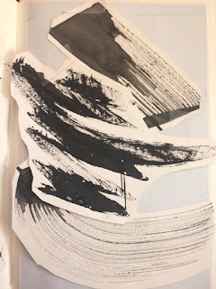
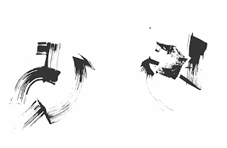
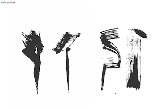
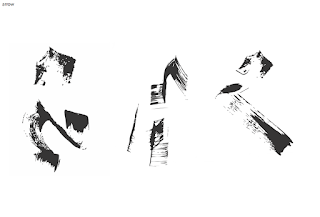
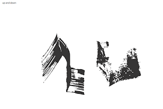
I experimented using black ink and black paint with different utensils such as; a paintbrush, some cardboard and some wood. This is shown in the pictures below. I kept my strokes light and thin whilst making sure the wrist is strong and keeps in the same position - this was the main thing you need to remember whilst trying to replicate blackletter. I wanted to experiment with scale, thickness of line and also the utensils I used - as I said earlier. 
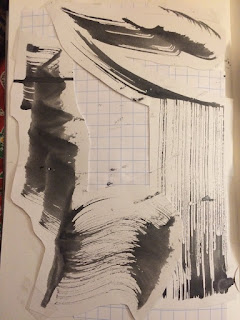


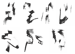
I then rasterised my images on illustrator to create pictograms. When I first started looking and my images on illustrator I wasn't happy with the fact that there were so light in some places where I hadn't used as much ink as I did in the other places. However when I looked at them as a whole as they are displayed below I started to like them because they are all similar so could easily be a sign system that linked. Another reason I believe that my pictograms are starting to look good was due to the fact that more than 2 of my classmates went past them and said that they were legible and easy to know what they are. 
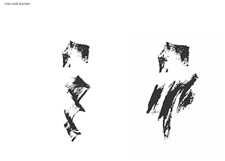


The difference in light and dark of my pictograms is what made it look like this image below and although I like the use of blackletter in graphic design here to me it wouldn't seem as if it is legible even if it was used in the same context as mine.
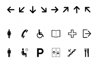
I thought I should move on from the pictograms I created and try to make them more into a sign system of pictograms that were simple and easy to use. Below I am showing you my example of the 'man and woman' which would be used for toilet signs. I went back onto illustrator  and used the 'man and woman' and created them into whole shapes that are a lot more legible because of the fact that they are solid shapes which are bold and striking. I played around with the fact that they are man and woman using blue and pink to represent them. My preference out of them all is the middle one, where the shapes are filled in with colour because I think it gives it an accurate representation of what they would look like in the context of going on toilet doors.


Wednesday 21 December 2016

STUDY TASK 2 - OBJECTIVE SYMBOLS OF SUBJECTIVE THINGS - OBSCURE AND SENSUOUS


Sensuous - synonyms - aesthetically pleasing, aesthetic, pleasing, pleasurable, gratifying, rich, sumptuous, luxurious.

Obscure - synonyms - unclear, uncertain, unknown, in doubt, doubtful, dubious, mysterious, hazy, vague, indeterminate, concealed, hidden.

These images were my initial sketches that I did when I was looking into the obscure, sensuous and paranoid. From this point on I chose to develop on the words obscure and sensuous. With sensuous I started to use the curved and long sort of lines to relate to the aesthetics of word. I mostly drew with a light sort of line with curves to imitate the word.

Then moving on to obscure I wanted to create harsh sort of diagrams which go against each other.  When creating them I was constantly looking back at the synonyms to try and remind myself of what I was trying to achieve. I think doing this really helped me with my project.


I then started to experiment with cutting up letterforms and making shapes shown in the photos below.


The letter E I experimented with was meant to be in the design of the word obscure, taking away and adding some parts to each shape to coming up with some simple ideas. I think these represent the word obscure well because they are all unclear and abnormal.


I then moved on to look at the letter Z, i chose this letter for the word paranoid because it is the most unused character in the English language, which to me feel paranoid because it is being left out which can lead to someone feeling paranoid. I also had the train of thought that when you are paranoid that you repeat yourself and you overthink things which is why I reused the letter Z over and over again. 


I then recreated them on illustrator to give my project more depth.
OBSCURE -


SENSUOUS -

Monday 19 December 2016

CHOSEN BOOKS AND IDEAS

The Brief for this project was to choose 3 penguin book covers that already exist and redesign them whilst using the Marber Grid. In order to respond to this brief I've decided to design books covers for three of Jane Austen: The Complete Works. They consist of Sense and Sensibility, Pride and Prejudice, Mansfield Park, Emma, Northanger Abbey, Persuasion & Love and Friendship. The titles in bold are the three that I created the sleeve for. I chose to do it from one author rather than just random Penguin titles I liked because I wanted to create a common theme throughout them all.


When researching into my book covers I loved the repetition that had been used on a lot of the covers that I saw, another thing that caught my eye was the simplicity of the book designs and the use of only 2 colours keeps the consistency throughout the book series. 

I don't want my book sleeves to be too similar so to try and keep away from this I think the best thing to do would be to stay away from the use of repetition in my covers. I thought the best thing to start with was to think of a symbol to represent al three books. To do so I looked into each of them and spent time thinking what would be best for which book. 


Using these I then developed them by creating the best ideas into physical things. 

MARBER GRID


The Marber grid was a grid system that was created in 1961by Romek Marber, it changed the look of penguin book covers forever, especially the crime section. By collating the typographic information and the colophon together within the top third of the page, he allowed for over two thirds of the cover to be used by the illustration, effectively giving the cover artwork the space needed to capture a browser’s attention and sell the book. Thus allowing Marber to maintain Penguins long standing image of typographic covers whilst also putting in the aspect of illustration which was more of a modern aspect to the design at that time. Showing that this particular grid system was about to be very successful because in time it was adapted and used by many.

Thursday 8 December 2016

MY COLOUR SWATCH BOOK


This is my final outcome in response to colour theory. I kept the colour scheme basic and quite plain with some line aspects to keep it interesting. I wanted it to be a simple colour scheme to keep the focus on to the actual work rather than the background colours. I think this worked out well for me. When I first printed this I found it hard as I created it on illustrator and working out which page has to go next to the other was very difficult and wasted a lot of my time. For the next time I print it I am going to use Indesign and print it on nice paper. I am going to look into the weights of the paper to see what would work best for me. 

Wednesday 7 December 2016

BOOK DESIGN RESEARCH


I started off my research by looking into different book designs. I wanted to have a simple and normal layout by using a simple layout of page after page. I looked into using tracing paper as some of the pages to create a fun aspect to the design. However when I looked at the content that I was going to put in my book I realised that all of my pages had writing on them and if I was going to have some as tracing paper it wouldn't realistically work because you would not be able to see the writing. 


I then found this lookbook which I thought was good as the colour scheme is all the same which I think looks good and the use of line is very good.

MY COLOUR SWATCH EVALUATION

Using a section of my photograph taken in Leeds it gave me an area that I used the eyedropper tool to get a selection of colours to use in my swatch. This then gave me a variety of colours that were similar but also some that were contrasting. I think that y swatch is good as it has colours that are varied in tones for example you can see in the image that there is a range of blue to grey that are all similar and would work well together. I think that it is successful due to the fact that all of the colours that are in my swatch have colours that are similar to each other ranging from yellows and beiges to pinky reds and bluey green greys. 


Tuesday 6 December 2016

COLOUR IN GRAPHIC DESIGN

Colour is one of the first things that can grab your attention when looking at a piece of graphic design. It can either make you think that the piece is beautiful or it can easily disgust you. Thus showing that in graphic design, I find colour to be an interesting topic. The choice of colour is hugely important and is one of the most powerful tools that a designer can have an understanding of. I believe that colour is easily a bigger aspect in a piece of design than for example typography is, due to how colour affects communicating a message effectively.

As humans we all associate colours with feelings, this is natural. Many people think of white as being hygienic, positive and pure. Whereas red can be thought as dangerous, aggressive and powerful. Baring this in mind you can then start to realise just how important colour can be in graphic design. For example if you are designing a logo for a green peace company you would think of using green which is associated with environment, balance and harmony. However if you decided to then design a peace company with the colour red you are giving out very mixed messages which to me is not what you want from a piece of graphic design. When designing I believe that everyone needs to remember just how big of a role colour has in communicating meaning and putting across a powerful message.

Everyone can interpret colour differently, however it does have underlying similar outcomes for everyone. It can attract your attention, change your mood, and can play a major part in how we see or define things. Colour can easily persuade a person, which is why it is so important in graphic design. A study of the worlds top 100 brands, determined by brand value, showed me that 95% of brands only use 1 or 2 colours, 41% use only text, 33% use blue and 29% use red. I believe that both blue and red are used in brands because they have a striking affect and if I walked past something bold and red in the street then it would make me look at it thus promoting the brand, doing exactly what the company wants. Colour choices are critical when looking at the success of a brand. A colour has many different meanings, however the perception of the colour is based on the meaning they symbolise in that culture.

Overall in design I find websites, brands and zines that have bright colours to grab my attention more thus making me look into it further. However I think it is very easy to get caught up when designing and make the design look too decorative with too much colour, which instantly makes me hate the design, and therefore the brand that goes with it. When looking at colour I do believe strongly that less is more because overall the design is there for a purpose to convey a message, and that is the most important thing.

6 EXAMPLES OF KLEIN BLUE


Above I have shown 6 example where in the Graphic design world, International Klein Blue has been used. I have layed it out in a way which I believe shows a differnece where IKB is being used as a background colour and in opposition where it is being used as the foreground main colour.

Personally I prefer the use of IKB as the foreground colour because I think it gives posterthe images more power to stand out.

PANTONE

Pantone is a standardised colour reproduction system, which uses the Pantone number codes to identify colours, which can be specifically used for printing. The most commonly referenced colours are the Pantone solids palette, which consist of 1,100 colours which each have its own individual reference number. The palette was originally created to help designers and printers control colours, so that they stay the same for their print projects.

Mixing CMYK inks can remake some of the pantone colours, however others must be pre-mixed inks. Pantone has guides for their spot colours called solid ink colours. Samples in the process guides are therefore colours achievable through mixing CMYK inks. A guide can also show you the spot colour and also how it will look when it is printed in CMYK. This is because then if spot colours cannot be used, close colours may be mixed in whilst doing it.

The PMS (Pantone Matching System) system uses pre-determined, published colour formulas to form a number of ink colours. The pantone colour chart is quite similar to the paint swatch guides. Making a pantone spot colour is like mixing the colours red and blue to create purple however with much more precision.

CMYK vs RGB

RGB and CMYK are both good but for different uses. RGB is an additive, projected light colour system where as CMYK is a subtractive, reflective light colour system. This means that RGB maxes at white, which is the same as if you were to have all the lights on at full brightness. Whereas with CMYK you need to add different coloured inks to the original white paper to absorb or subtract the light that is reflected.

RGB refers to a system for representing the colours to be used on a computer display. Using a combination of blue, red and green to create a colour spectrum to obtain almost any colour imaginable. RGB is generally left with a much brighter and much cleaner result, which is why; it is used on computer display.

On the other hand CMYK refers to four inks used in colour printing; cyan, magenta, yellow and black. CMYK colours tend usually to be duller in comparison to the RGB colours. This is due to the combinations being made by CMYK being relatively dark.

What you must bare in mind when comparing and contrasting these two is that you cannot display the exact same colours in RGB and CMYK.

Sunday 4 December 2016

GROUP VIDEO


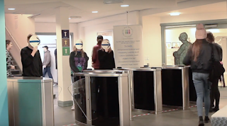
This was my groups video where we were experimenting with different ways how to disrupt the flow of traffic. We did gain a lot of attention whilst doing this however it wasnt really the reaction that we wanted when we did do it. I think, using Frutiger’s idea of how a red circle outline can change the meaning could have changed it into more of a command.


In this image you are shown to when our experiment did work. It wasn't a sign telling people where there were allowed to go it was arrows and we used it as if it were a diversion and as the video shows it worked.

MY COLOUR SWATCH

I used my own image from Leeds to take a colour swatch from a section of the image and tried the swatches out in different orders to see what the colours looked like with the other colours.
I then also did my own version of Albers Homage to the Square using this colour palette.