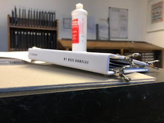
I also decided that because this is not a 'DAZED' magazine, instead of it is a Look-Book that would come alongside the magazine as a small feature. Due to this fact I decided to call it 'DAZED INTRODUCED'. As I thought it could be something like an introduction for young artists who want to get their work out there. Hypothetically if this was the case then Freya here would be introduced to all the DAZED readers.
I initially started to look at the layout of each component and where they would look best placed. My main focus was on the collaboration aspect. The X here representing the collaboration aspect to combine the two together, and decided to play around with this further.
After playing around with that aspect of the front cover I decided to look at the front cover and how that could be improved. To do so I decided to look at my cover research and how they have been created. I then further experimented with the layout so there was something that I could gather feedback initially from peers and then I could take back to another meeting with Freya to see what her thoughts are.
I then sent this image to some of my peers to gather some feedback and to see what they would do to change / better the front cover. The most common favourite was the bottom second from the right. and the top right one. The most favourite was the bottom second from the right due to aspects such as the mixture of background and foreground, and the 'DAZED' is halfway through the white and blue. However one of my peers suggested that if it is a front cover (which it is) then the DAZED logo does not stand out as much as it possibly should for a cover page.
I thought the best thing to do was to develop both of those to see if I could make them into one. I thought I could try to merge the two into one to create a good balance. To do so I will further experiment by trying out changing the KENZO DR MARTEN writing to white / red to give the same sort of effect that that is it the most liked cover design.
I thought the best thing to do was to develop both of those to see if I could make them into one. I thought I could try to merge the two into one to create a good balance. To do so I will further experiment by trying out changing the KENZO DR MARTEN writing to white / red to give the same sort of effect that that is it the most liked cover design.


