


I want this to be printed off maybe A5 or A6 size as I want it to be photographed alongside the diffuser as a mini leaflet that is informative about what the diffuser is and what it can be paired with to make you have the best calming and relaxing experience.
I started off with the type face called urban incline however after a crit I had It was suggested that I could use a typeface that was less bendy and also as it is being printed on a smaller scale then as the 2 lines of the type are so close then it would be unreadable. It was also said that my colour scheme is good and the colours works well together. Another aspect that was suggested to change was the white space around the red box as it is a bit in your face and could be changed. Moving forward from this I am going to have less white space by maybe including some small illustrations.


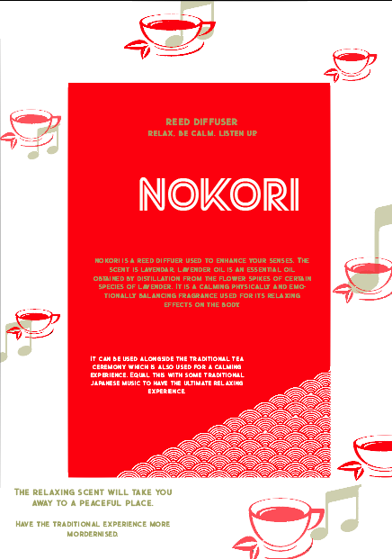

I originally illustrated a fish and a tea cup to represent the tea ceremony and a fish to represent the Japanese culture. The second typeface was the one I decided to use is called Street Cred. I preferred the spacing of the 2 lines used for the type. however I decided to change the kerning to make it closer together to create the look I wanted for this brief.
No comments:
Post a Comment