Monday, 20 November 2017

OVERALL MODULE EVALUATION

Design Production has overall been a challenging yet exciting module for me. The two different briefs were stimulating and pushed my design practice. Brief one was a great introductory project for my second year, allowing me to settle in to the work environment. One unexpected challenge we received was also in brief one. The exchange of research completed over summer was an interesting development and many people were unhappy with this idea. Looking back on the project I now understand the reasoning behind it.

 The idea that it would allow students to face solely on the design of the publication instead of the content was correct in my case as I did focus on just the design aspects, however I was very excited to use all the interesting and fun research that I had collected over summer which I would have loved to do a project on. I feel I would have done my best in this editorial design brief if I was interested in the topic at hand. However this brief has tought me that you won’t always love the content when you are working yet you have to still meet the deadlines with a finished project that meets the aims.

Brief two allowed me to work outside my comfort zone and develop a higher level of technical understanding for applications like Adobe XD, which I had never used before, designing an app. I enjoyed this brief a lot more than I expected, I believe it was the combination of working collaboratively which I really enjoy as you get to bounce ideas off one another constantly and doing something that I have never tried before. I think brief two was the most stimulating for me because I was entering an area of design which I lack experience in. It was a big learning curve, especially in the communication aspect and I am very pleased with the end result. 

I did find aspects of this module enjoyable and I feel that I completed each of the briefs to a standard that I am content with. However, upon reflection, I know that there are areas that I would definitely like to improve on, develop and push further in my personal design process and approach to tackling the briefs that are ahead this year. 

Now that the module is over I believe the best thing to do is to reflect on it, look back and see what I could have done a bit differently which I thin helps me for my future modules. An example of this, if I were to retake brief one again I would look further into stock decisions and take more time on the binding as it was very awkward with all the different sizes of paper. I would allow myself more time to make these mistakes next time.

Design production as a designer I think has really helped me. I have learnt a range of new skills and improved on existing ones. I feel my time management and engagement with feedback has progressed significantly since level four, however I still believe it needs to be improved on.

Sunday, 19 November 2017

FINAL OUTCOME SB2


We altered the workflow of our previous XD document as shown below to be in a more coherent order. 


After our successful crit we added some more character as it was suggested to us by using our illustration with new speech bubbles like the example that is shown below. 

The added illustration pages are below, we wanted to keep consistency throughout so instead of illustrating more we decided to use the same illustration so that it does not get confusing for the user.


Saturday, 18 November 2017

FINAL CRIT SB2


Our final crit was very successful, from this crit we are glad that we captured the authenticity of the shop in our app. There was one main theme that everyone said we could improve on which was the character of the app. The illustration of the man was loved by everyone and it was suggested that we include more of that throughout the app because it really gave the app the humorous feel that we were going for.   


Friday, 17 November 2017

SB2 PRODUCTION / DEVELOPMENT

Production for our app was good fun, we wrote out all the necessary words to use, scan them in. To add a sense of Bakery 164 we included aspects like of course the handwritten type titles,  the metal floor that is in the shop from a photograph we took, an illustration of the man who shouts in the shop with a speech bubble, images taken in Bakery used for the background for the menu, written ingredients for each specific sandwich and the wooden block that says your order number. We played around with the layout of each page and decided on the final layout together according to what would be best for the user and what we think represents Bakery 164 the best. 


BAKERY 164 APP BEFORE CRIT LINK


The video above was created through the use of XD which was new to both of us before this brief. We found it difficult to first use XD but when we got into it we thought it is a great application to use. Below are screenshots of the workflow of each page from the app.


Wednesday, 15 November 2017

CRIT - SCREEN

The main aspect we wanted to get out of this crit was which version to create and how to make that the best that we possibly can whilst making sure the user experience is good. We pitched the two different versions to the group whilst showing the designing we have done so far. It was unanimous throughout the group that we should go with version B. The feedback we received was that it had so much more potential and that we should look into more ways to show the quirky character and features that Bakery 164 has. It was suggested to maybe look into seeing if we could record the man who shouts the numbers or maybe even photograph him and include that as another humorous aspect to the app. We think that our crit was very positive and the next stages are to get the designing done and make sure that it is user friendly. 

Monday, 13 November 2017

SB1 PRODUCTION


When creating my Indesign document, I needed to set it up properly and to do this I had to make sure the PPI matches the effective PPI of 300. I originally put all the images in as pngs which I then remembered after I had done the layout that was was the incorrect format so I had to redo it all and save the images as tiffs instead, this was a silly mistake of mine that I am sure not going to make again. I also struggled when setting up the documents for the writing section of my book. I had to alter the document many times whilst printing. I originally printed them like this : 


It took me a while to get the settings correct on the printer as shown below I had many testers. But I ended up finding out that this layout doesnt line up the correct type boxes with the others on the page. 


I ended up editing the Indesign document and printing it so that the correct text boxes line up to the other correct text boxes. I then had to do this for all 5 separate pieces of text. 


When printing my front cover I had to adjust the printer settings again so that it would print on my card and I had to place my image in the correct place so that I could make my sleeve correctly. My first couple of trys of printing did not work so well as shown below however it ended up working nicely. 


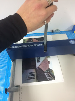
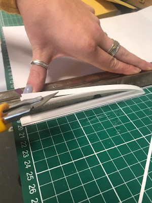
Once I printed it all I wanted a clean fold in the centre of my publication and for the sleeve so I used the folding machine in the digital print room. I also then bound my book with green thread to inkeep with the ecological aspect of Letchworth. Once I had bound the book I then had to trim it all down, an issue I had with this was that I trimmed the cover before the main pages of the book so I then in result had to trim more off than I originally wanted. 


Sunday, 12 November 2017

DESIGN DEVELOPMENTS - SCREEN

For version A we looked into the design and how we could modernise it. It was suggested to us that we find a typeface that looks as if it is handwritten, much like the LUSH branding. Below shows the typeface we chose in comparison to the LUSH typeface. 

Creating these designs we kept in mind the user experience and how we need to make our app very simple and easy to use. Below are our first simple designs for version A. Keeping very strictly to the colour scheme and keeping it simple.


For version B we wanted to make sure that the feel of Bakery 164 was not lost, to do this we thought we would make it humorous and use the quirks to our advantage. An example of this is below we photographed one of their number tiles that we want to pop up at the end of your order keep the authenticity there. We also wrote out all the titles in a similar style that they use in the shop and scanned them in to use.


Below are some of our original design ideas that we have started with that are heading in the right direction for this version.


Looking at both versions we were leaning towards version B. Version A has no character and we don't feel like the app is an accurate representation of Bakery 164. However we were thinking there are many ways to improve this so we are going to take this to our next crit and see what feedback we receive.