Wednesday, 30 November 2016

Pictograms and signs


Pictograms -
Pictograms warn, guide or protect the people that are using the, they also are there for very immediate messages meaning they must get straight to the point and also be universally recognisable.

Syntactics - 
These are a set of rules that govern how the signs work well together.

Semiotics -
is the study of signs and symbols and their use or interpretation. They are dependant on knowledge, society, cultural attitudes and context.

Pragmatics -
signs that tell you things depending on the environment around you

Indicative - indicating what can happen but does not have to happen

Imperative - telling the viewer what is allowed or not allowed

suggestive - suggesting to the viewer what to do but they dot not have to listen

Basic Signs 

The Triangle -

On its apex a triangle is used to create a sense of direction, tell the viewer to go either left or right, most commonly used on roundabouts or T junctions.

Normal triangles are used most commonly as warning signs warning the viewer of what is coming up ahead in the area.


The Circle - 

The circle sign is most commonly used for regulatory signs, telling the viewer what is allowed or not allowed in the upcoming area. Another thing they are commonly used for is speed limit signs.


Sunday, 13 November 2016

OUDG403 - Evaluation

Throughout this module I have accumulated new skills and knowledge that will remarkably impact my design in the future. Before coming here making informed design decisions with purpose was not one of my strengths, I found it hard to make a decision without going back on it and changing my mind. This effected my work greatly due to the fact that I then had less time to actually design. Now I am starting to take more care and think about why I am making the decisions that I make. 

During this module I have become more conscious of what makes up lettering and type and how there are actually a lot more components to it than I thought such as weight, serifs and strokes. Learning about these has also helped me see how much they impact type as a whole. I now notice when walking past shop signs what I like and dislike about them and why. It is not only the serifs and weight that effect the image that is given off by specific type and lettering but also things such as the kerning and tracking that change its character and nature. 

Another thing I have learnt from this module is that not all research is online. It is about going out looking around you and seeing how the things you see around you influence your design and why they do. This has given me a sort of understanding that I can take in inspiration from anywhere that will effect my practice in a useful way. However it is still extremely important to research online to the full because there is always more things to be found. This became apparent to me when I was researching for both briefs because of the great effect that all the characteristics that make up a typeface or a logotype has on a brand and its overall image due to the personality that is portrayed.

I find the group crits extremely helpful for me and is a good learning curve for me because I still am not very good at portraying my thoughts into words and having to do this for the crits is helping me to improve. In group crits I am also trying to use better terminology to aid me in the future.

Brief 2 was overall the better brief for me because unlike in brief 1 I started off by doing more sketches which helped me produce a varied body of work which aided me to get more feedback that was actually useful and that I could change to create a better outcome.

Overall I think this module was a great start to having design skills and general understanding of typography. I definatly think that my outcome was a lot better in brief 2 which is good because it made me realise what I had to improve on from brief 1.

Saturday, 12 November 2016

OUGD403 Studio brief 02 - Final Crit and Evaluation

Final Crit

The final crit really helped me because I got feedback from 13 people in my group giving me a variation of different peoples views. For the crit I laid out my final typeface on my specimen along with my rationale.


The main themes in my feedback were -

- the feminine and delicate personality of the type comes through due to the fragmented characters, also it makes the lettering more interesting and is not an obvious approach - making the context relevant to the word
- the colours used on my specimen contribute to the feminine look - could try changing the actual typeface colours to a darker pink?
- background of the specimen works well however may not be an obvious link to a high brand fashion magazine
- swash of the 'f' 't' 'y' work well for your adjective
- could make it more delicate by making the weight even lighter / thinner
- very appropriate for a fashion magazine / high fashion
- choosing an italic variant was appropriate as it contributes to the feeling of elegance being portrayed
- use of bracketed serifs works well - could have made them more rounded if you wanted to take it further?
- the serifs are well underlined - adding authority to the typeface especially for a feminine looking font


Evaluation

I really enjoyed studio brief 2, I think this was due to the fact that we got to choose our adjective which made me really think about the adjective I wanted and how I was going to use that to develop interesting research and in the end give an outcome that I was pleased with and something that I was excited about. Overall I am pleased with my outcome, I think I have done exactly what I set out to do by creating a delicate yet authoritative typeface.
The thing that I would have loved to develop further would be playing around more with the weights because many people in my final crit said that to take it further the best thing to do was to make the lettering thinner to reiterate and make the delicacy prominent in my type.
Doing this project has improved a lot of my skills and I have gained more knowledge in type creation and how a typeface needs to work overall.
Working so closely to illustrator has really benefited and it will benefit me greatly in the future because it is a really helpful and useful tool to use.

Friday, 11 November 2016

OUGD403 Studio brief 02 - Typeface specimen and rationale


Rationale - 'belle' 

A typeface which is was inspired by Baskerville italic, using bracketed flat based serifs whilst adjusting the weights of the lettering and breaking up each letter into fragmented shapes setting a sophisticated and feminine tone to the typeface. The idea was based on research into fashion magazines and blogs such as Elle, Vogue, Bazar, Man Repeller and Park & Cube. My typeface portrays the idea of being fragile and delicate, the feeling of being close to be broken by the fragmented shapes whilst having a sense of authority portrayed by the flat based bold serifs. Belle, my delicate typeface purpose is intended for a large display like on a magazine or a blog, this influenced my design decisions because at the back of my mind I was always thinking about how I was going to make my typeface feminine, because if it is going to be on fashion blogs the majority is based on a focus group of women, which relates to why I chose to use bracketed serifs and have the fragmented shapes. 

Tuesday, 8 November 2016

OUGD403 Studio brief 02 - Final typeface, applications


Final Typeface -

I think as a whole my typeface looks good, however I needed to find out if it works in a sentence or as an application which is why I have done the examples below. 


Ideas for my application -


My applications -


I think my applications really set my mind straight that I think my typeface works well in the context I have put them in. The give off the sense of authority whilst being delicate which is exactly what I was going for. 


OUGD403 Studio brief 02 - Development


Development for my design -


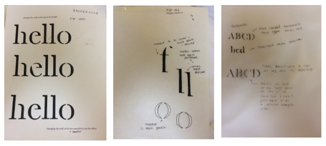
After my crit I decided to focus on the italic version of Baskerville because it is more feminine which is needed because I think my typeface could be used on titles in fashion magazines or beauty bloggers logotypes. Both of which are very feminine things. However I think they also need to legible from far away so to adjust my typeface into being more legible I think the serifs and the overall look of Baskerville italic is too curvy. To change this I am making the serifs flat based to look more professional.


Above are my designs for my letters, on the left I started by putting my ideas of making gaps in the letters, flattening the serifs and changing the weights of the letters. However you can tell I had to redo some of the letters because I made the mistake of putting an angle on the serifs and not keeping them straight like I wanted however I soon realised my mistake and redid the ones I did wrong.


I then scanned them into illustrator and added the rulers and added guides to help me keep the spacing and x-height all the same to keep the rules the same for all the lettering. This took me quite a long time to do however I am quite please with the end result.

Friday, 4 November 2016

OUGD403 Studio brief 02 - More design and Interim Crit


Crit Feedback

I found that the interim crit was quite helpful in actually creating my typeface because it gave me the boost and further ideas needed to finish my typeface. The group said to me that they thought I could take the delicacy of the typeface further. To do this they suggested I manipulated and played around with the width of the typeface because they thought it didn't look delicate enough. Someone also suggested that making it italic could also give the more feminine and delicate look that I was going for.

I decided also to move away from my initial idea of transferring the characteristics from Baskerville onto Helvetica because I tried and tested it however it did not work so I am going to just manipulate Baskerville to get the look. I am going to focus on lowercase letters because they give me the delicacy that uppercase doesn't have. Uppercase is bolder and in your face which is not as delicate and feminie as lowercase. I was also given the idea to play around with the ascenders and descenders and weight.

Wednesday, 2 November 2016

OUGD403 Studio brief 02 - Developing my idea


To start with I tried out my idea of putting characteristics from Baskerville onto Helvetica. However whilst doing this on uppercase it doesn't look feminine or delicate at all, in fact it is the complete opposite of what I was going for which was ridged and strong. So I then tried it on lowercase but I really struggled with adding the gaps because the letter was not very rounded - this occurs in letters like 'c'. I also did not like the 'g' in helvetica because it is not as delicate as it is in in Baskerville due to the glyph. 


I then did some further research into delicate typefaces and what it meant to be delicate and fragile. Looking into it they are very different.  Delicate things, like a flower, a necklace or someone's feelings are fragile, easily broken and often quite beautiful. Whereas fragile is broken or damaged, destroyed and threatened. 


So I then played around with the serifs and how I could manipulate Baskerville as a typeface to represent my word. Whilst doing this I thought the serifs I was creating were too harsh and bold not giving my lettering the look i wanted for my adjective.