
Looking at a different idea I then created a fence pattern on illustrator portraying the innocence of the children that is trying to be kept in by this fence. Here I was just playing around with colour and layout. When I was looking into the previous book cover designs I noticed a common colour choice was the orange which I think worked well so I tried that out.


Then looked at adding on different colours and all the information on the back to make it more exciting and have more character. I chose this blue to contrast the orange and make it more interesting.


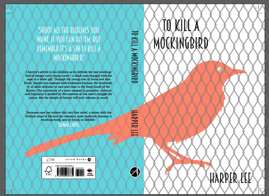
I then just played around with different colours and different layouts to see what would look the best for my design. Here I looked at adding the aspect of the yin and yang to the birds eye to represent the coexistence of good and evil.


My last experimentation was looking at using the bible that was used in the court as the background - I used worn black leather look to show what the bible would usually look like then a fingerprint to show that you have to swear on the bible to tell the truth.

No comments:
Post a Comment