Throughout this module I believe that I have become a lot more independent and I also believe I have been allowed to develop a more self-directed body of work communicating visually through my designs focusing on type and image. Something else that is new this module is working collaboratively to explore solutions in a group to specific problems and briefs. We have been investigating aspects like layout, typography, editorial, social media, traditional print and paper based print.
Something that helped my time management in this module was the fact that we had a live brief. I think this made me do more designs as I went along because the deadline was not set by the college but it was a competition so I knew I had to get it done. During this brief I think my design changed and developed due to peer feedback which really helped me.
During this module we have looked at a lot of different aspects as there has been 4 studio briefs which has helped me establish a deeper understanding to design process as a whole. One aspect I found both challenging yet interesting was the traditional print methods brief. I wrote my COP essays on traditional print so it was great to get a chance to use it for a brief. However there was a lot of things that went wrong that I had to amend throughout which made the process very long and tedious at times however I persevered and got the brief done to a standard that I was pleased with.
One aspect that I believe I have improved on throughout this module is my communication skills and working with others. It can be hard working in a group if not all of the group is willing and organised. Not only has it improved my communication skills but also my organisational skills as I did not want to let down either of my groups.
Something that I have developed further in this module is my critical and reflective approaches through documentation and evaluation of not only my own work / design but also my groups work and designs.
Something I think I would improve on if I were to do this module again would be to research in more depth as I believe I had researched for other modules a lot better than I have in this one. Even though I have done research into current graphic design practice there is not as much which could have effected my own work.
Studio brief 2 was the brief that I enjoyed the most as it was through the use of traditional print and I personally believe that it had the best concept behind it was the best as I put a lot of thought into what each design should be and what they would look like as a whole.
Overall I think this module was a great start to helping me understand design process. I think this module helped me develop a better understanding for people skills and traditional print methods. I loved working in groups, I found it very rewarding.
Friday, 19 May 2017
SPEAKING FROM EXP - FINAL CRIT / EVALUATION
From our final crit we received a lot of feedback on what the peers thought about my design. They said that the red of the heading looked out of place so try to put another red aspect somewhere on the page. It was also suggested that we change the days of the week to the correct colours instead of black and white just to reinforce the identity of the weeks and to make it even simpler for the viewer.
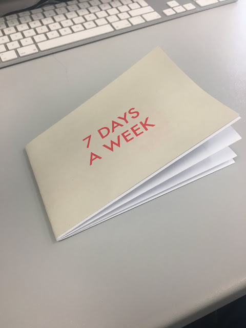
Overall I believe my final complete brief works well due to the simplicity and it being easily understood. Because of all the colour coding throughout the design I think it is very easy to read and you can tell which point is where. The deals aspect of the design is very clear, from peer feedback I was told it is easy to follow and understand which is which. This is due to the fact that I changed the days of the week to match the colour scheme to make it even more obvious which deal is on which day. If I was to do this brief again one thing I would change would be is the sides to which the two headings are on.
I would have ‘A guide for deals in Leeds’ on the front cover rather than ‘7 days a week’ as it is the first thing you look at when you see our map. It was the correct design decision to change the paper to a thicker paper for the headings as it is tougher and thus has more wear in it which is what we want because then the first years can have it for a longer.


FINAL OUTCOME


After peer feedback we decided to add a red box around the days of the week because we were informed that the red of the title was a little out of place and they thought we should add the red elsewhere to keep the consistency throughout.
our colour scheme was good as you can easily differentiate between all the colours, which is what is needed from a simple map.
We first screenprinted the headings as we were not definitely sure how the red was going to turn out, thus meaning after we screenprinted we could match the red to the red of the box. The reason we chose to screenprint the heading was because we thought the first years should know the difference in the colleges resources but also because when you screenprint the ink is applied thick than digital printing which results in the colours being brighter and showing the colour we wanted. Not only this but there were too many different colours for us to screenprint each pictogram.
Thursday, 18 May 2017
PRODUCTION SPEAKING FROM EXPERIENCE

To produce the headings / the outer cover of the folded map we screen printed onto thicket paper so it would have more wear and last for a longer amount of time. For production of the map we decided to do this digitally because there are too many colours for us to screen print we would have to have around 8 screens at the same time which was not feasible. We also thought it would be a good idea to show the first years the different resources that they can get here at lca.
CRIT
In the crit we received a lot of positive feedback. Everyone thought the idea was good and informative which is what we set out to do. However we were told that we were not really showing he use of the colleges resources enough and it was suggested to us to screen print the headings which acts as the front cover. Not only then would we be using the colleges resources but we also will be making the map last for longer.
We were told to look into the tube fold up map:

We were told to look into the tube fold up map:

It is hard to tell in this picrture however if you look closely at the top there is a harder back cover which was the sort of thing that peers told us to have ours like.
Wednesday, 17 May 2017
SPEAKING FROM EXPERIENCE DEVELOPMENT.


Above are examples of my map design development looking at white space and the colours scheme used, I wanted to keep the design very simplistic and easy to read. I initially started looking at different ways to word our name but all of the other options we came up with i did not like as they did not look aesthetically pleasing in comparison to the name we chose.

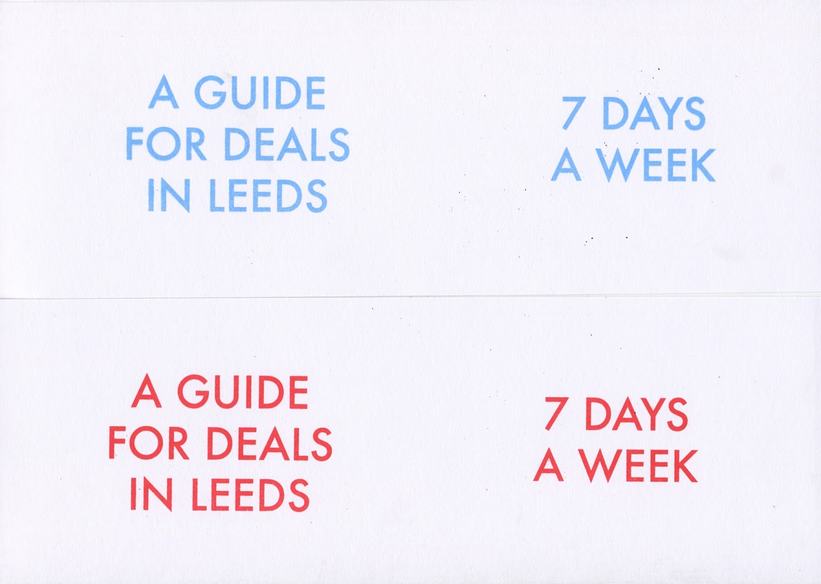

Above are a couple of examples from the screen printing we did for the headings of our maps my fovourite was the red as I believe it is the most eye catching out of all of them.
Tuesday, 16 May 2017
SPEAKING FROM EXPERIENCE RATIONALE / SKETCHES
Having come to Leeds as a first year and not ever been here before apart from open days, our knowledge of the city was minimal. Throughout the year we have discovered and learnt the best places to get deals and where is the best place to go on which day of the week. We intend to use this information to create a colour coded, folded, informative A3 map which shows next years first years these places they may not know that we have discovered. From A3 it will fold to A5 size so it is easy to carry from place to place.


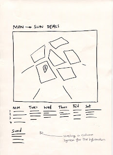


For the initial ideas of our map project we looked into what sort of map we wanted to go for shown in figure 1. This was to see if we wanted to have the area of the map coloured in or if we wanted it represented by pictograms. We decided to represent it through pictograms due to the fact if we filled it in then it would make the map design look overcrowded which is not what we wanted to go for as the locations must be distinguishable.
The quick sketches we did to gain a rough idea of what we wanted our design to look like which I think helped us decided which sort of design we wanted to do. The reason I created this map the size that it is was because all the deals we found were all in this parameter so there was no need to create anymore.
RESEARCH INTO WHAT PLACES TO USE SPEAKING FROM EXPERIENCE


From this list we then took out any that we believed were too far out for the first years to get with and we were left with the ones that we want to put on the map.
Monday, 15 May 2017
END OF MODULE SELF EVALUATION
Throughout this module I have gained new skills and knowledge that has and hopefully will keep on impacting my design for the better. I think doing this module has helped me establish a deeper understanding of visual language and design principles as a whole. I have learnt new vocabulary and have explored new ways to approach the problems that were set in both of the briefs. I have learnt that type, layout, image, format and composition are all relative but all have very different meanings that need to be treated differently.
During this module we looked extensively at grids and how they can help your work look cleaner. I think the design of the Marber grid was a perfect place to start for me as it then taught me I could explore different grid layouts and even create my own to keep my work looking professional. From this I have then almost always used different grids in all my work, it has especially helped me within my design board layouts.
The use of visual vocabulary has never been one of my strong points, however through exploring the use of type and image within my design practice has helped me become more informed and thus boosting my vocabulary. Aspects like the pantone and PMS was something that I did not really know before this module. Due to researching into these I believe that I could now link this to my work in the future.
Another aspect that I have improved on is my ability to visually investigate and interpret the world around me, I believe that this has helped me develop the way I communicate what I want to say through the use of design. Through my colour theory booklet I was challenged to look at the world, through the use of a photograph we had taken in leeds, with an analytical eye and develop an individual understanding through investigation that helps me to communicate my ideas visually. Within my booklet I looked at Josef Albers Homage to the square and I created my own version of this using my colour palette taken from my swatch of the photograph taken in Leeds.
One aspect of this module I enjoyed learning about was colour in graphic design. Colour can hugely effect the way the human eye looks and feels about a certain design, for example people associate colours with feelings. White is associated with positive and pure where as red is associated with aggression and power. Learning about colour in graphic design has changed the way I then thought about my other briefs and how my use of colour will then effect the way the viewer looks at my design and how they interpret it.
Design process better in brief 2 as I had all the knowledge from brief one to then help me further with the grids and layout brief. I also believe as there was two tasks in brief 2 I had more work to produce and I liked the two different aspects of it as it helped me develop my understanding of visual language in relation to a personal area of interest, looking heavily at layout which is something that I enjoy.
Overall I think this module was a great start to helping me understand design principles and visual language. I think this module helped me develop an exploratory approach on editorial and publication design. I enjoyed the little amount of this module we had and would have loved to been able to finish it to the extent the module was intended.
Saturday, 13 May 2017
RESEARCH SPEAKING FROM EXPERIENCE
As our idea was based on maps we did some initial research which aided in us have a feel of what our design could look like when we produce it. Something that I looked into was different examples of maps that had been folded as that is how we wanted our design to be portrayed.


Wednesday, 10 May 2017
SPEAKING FROM EXPERIENCE INITIAL IDEAS & CRIT
For this brief I am working in a group with Kitty. We thought the best thing to do was to give the first years something that would be beneficial for them as they are most likely going to be new to Leeds and not know the best places to go. We had the idea of to start with doing a map of Leeds and showing them our top 5 places we like and why we like them.
However when we had our crit the group before us had pretty much the exact same idea so when it came to our turn we brainstormed with the group how we could change this idea to make it not the same as theirs. We came up with ideas like :
- a coupon booklet
- book of 10 best deals in Leeds
- map which is colour coded by each day of the week and what deals are on at that time
To differentiate ours from the group before we thought the best thing to do was to base it mainly on deals that you can get in Leeds. We decided to go with the third idea because it was still incorporating our initial research that we had done but making it more about the deals that you can get in Leeds.
Monday, 8 May 2017
PRESENTATION EXHIBITION BRANDING
For the group Presentation as a group we chose 2 people to do it. I think as a group it was a good decision to choose Neve and Liam as I think they are both good at public speaking and Neve did a lot of the catalogue work and Liam did way finding which were the two key parts in the exhibition.


This was the presentation that was created, the social media page has 2 gifs on aswell as the screenshot of the instagram page.
Subscribe to:
Comments (Atom)