


Above are examples of my map design development looking at white space and the colours scheme used, I wanted to keep the design very simplistic and easy to read. I initially started looking at different ways to word our name but all of the other options we came up with i did not like as they did not look aesthetically pleasing in comparison to the name we chose.

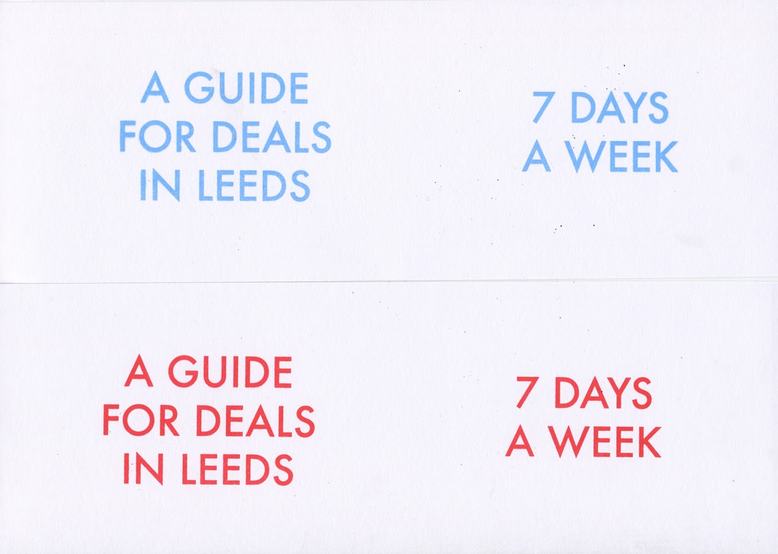

Above are a couple of examples from the screen printing we did for the headings of our maps my fovourite was the red as I believe it is the most eye catching out of all of them.
No comments:
Post a Comment