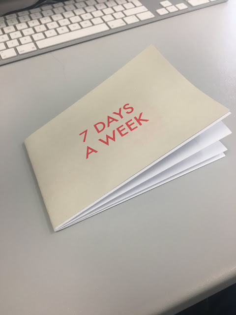
From our final crit we received a lot of feedback on what the peers thought about my design. They said that the red of the heading looked out of place so try to put another red aspect somewhere on the page. It was also suggested that we change the days of the week to the correct colours instead of black and white just to reinforce the identity of the weeks and to make it even simpler for the viewer.
Overall I believe my final complete brief works well due to the simplicity and it being easily understood. Because of all the colour coding throughout the design I think it is very easy to read and you can tell which point is where. The deals aspect of the design is very clear, from peer feedback I was told it is easy to follow and understand which is which. This is due to the fact that I changed the days of the week to match the colour scheme to make it even more obvious which deal is on which day. If I was to do this brief again one thing I would change would be is the sides to which the two headings are on.
I would have ‘A guide for deals in Leeds’ on the front cover rather than ‘7 days a week’ as it is the first thing you look at when you see our map. It was the correct design decision to change the paper to a thicker paper for the headings as it is tougher and thus has more wear in it which is what we want because then the first years can have it for a longer.

No comments:
Post a Comment