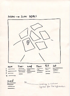
For the initial ideas of our map project we looked into what sort of map we wanted to go for shown in figure 1. This was to see if we wanted to have the area of the map coloured in or if we wanted it represented by pictograms. We decided to represent it through pictograms due to the fact if we filled it in then it would make the map design look overcrowded which is not what we wanted to go for as the locations must be distinguishable.
The quick sketches we did to gain a rough idea of what we wanted our design to look like which I think helped us decided which sort of design we wanted to do. The reason I created this map the size that it is was because all the deals we found were all in this parameter so there was no need to create anymore.


No comments:
Post a Comment