Sunday 30 April 2017

EXHIBITION BRANDING, SOCIAL MEDIA

Myself and Amy were the two people who were to create the social media aspects of the exhibition. We decided the thing to focus on the most was the gifs as they were the main aspect of all the social media that we believe would grab the attention of the viewers that would want to come to our exhibition. we split the list of gifs that we wanted to create and made some each sticking to using the thickness of the line in the logo for all the lines used in our gifs just so it looks more professional. I created these three gifs:


I then realised that we could not just have gif after gif on the insagram page. So I had the idea to use some of the prints as a class that we created on our own for our last brief and make them into the cyan colour and collage it so that it is just a snippet of what was to come in our exhibition. My group liked this idea so we did it and then I created an instagram account where I put together my gifs alongside amys and some of my classes work collaged together. 


You can also see here the countdown that I created for before the event. From my idea these gifs were created tat we also put on the instagram page.


Saturday 22 April 2017

INITIAL EXPERIMENTS EXHIBITION BRANDING


In order to develop all of our branding for our project we split off, with a clear idea in all of our heads about what we wanted our branding to look like. I was on Social Media side of the branding. After talking to my group about it I figured out the main thing that we wanted was a strong Instagram page. To do so the main thing was to look into gifs and what we wanted in the gifs. For me I found it hard because I had only ever made one gif before so it took me a while to get the hang of it. 

After our group crit we had a good idea of everything, I gained from the crit that we needed a few gifs, maybe some imagery of the exhibition space and the logo to go on the Instagram. For the gifs we had the idea of having some gifs that represent 'space' as a whole just to keep a strong reinforcement of the branding ideas going throughout. The best thing to represent space was shapes. I thought the best shapes to use were a circle, a square and a triangle. The main thing to keep throughout all of the gifs was the strong line going down the middle of the logo as that is a strong part of our exhibition. Both representing the timeline and pronunciation of Raum. 


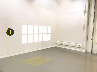
As shown in the image above I did a quick sketch of the start, middle and the end of the gifs just so I knew a rough outline of what I wanted and to help explain to my group to see if they thought it was a good idea. 

3RD YR DEGREE SHOW BRANDING PRESENTATION

Isla Pearce and Charles Worrall showed us their presentation for their proposal for their show, their branding won and was the actual exhibition branding used for their show.

The first thing they said to us was about what was most important which was to express creativity in a new and inventive way, show hard work and talent with a strong visual identity. 

Their initial ideas were :
- In the works - where they represent each subject area which was represented by an object for each whilst looking at process
- use photography and clean type however it needs to be visually creative

They then received feedback and found out that using one object for each subject would be too hard meaning they needed to look at representing the life at college in a more complicated way. To do this they looked at the college values to help them with their project. 

Their final idea needed to be eye catching and lead the viewers eye down to the bottom where the information would be. It also needed to be derived from the colleges values. They wanted their work to be different from the previous branding that had occurred they strived to do this through the bright colours used and subjective nature.  

GENERAL RESEARCH EXHIBITION BRANDING

For this brief we got research from :
- Unplugged Exhibition by Bureau Mirko Borsche
- Women Fashion Power by The Beautiful Meme
- Under the Same Sun by OK-RM


Tuesday 18 April 2017

SCREEN PRINTING PUBLIC EVENT


To produce my A3 print I used screen printing. I decided to use 3 separate screens to make my print more interesting and complicated. I found screen printing very difficult throughout the whole of the the process as there were many aspects that did not go as I had hoped. 

First I cleaned the screen then put emulsion on and then exposed it. However I then had to redo a couple of them as i put too much emulsion on one of them and then another time my screen went missing so I had to redo it. When printing the first thing I did was the yellow layer, then the black layer then the blue layer as I needed know where to put the blue shapes so I had to do the yellow layer first.

Overall I am please with the prints I created, there are small changes I would have made at the start of the project but at the end I grew to like them. The changes I would have made was to make all the yellow dots whole but I like the aesthetic that it gives off.


Wednesday 12 April 2017

PUBLIC EVENTS - METHODS THAT I COULD USE

Because this brief is all about printing techniques and handmade design I thought the best thing to do was to look into different methods or techniques that are available and something that I could use for my project. 

EMBOSSING - The process of embossing is extremely simple and cost effective. It is one of the cheapest ways to enhance the look and feel of any surface be it paper, cloth or metal even. There are several things that need to be attended to in an embossing project. The metal dies to be used, the surface to be used, the creation of the artwork and the embossing details of course. 


LETTERPRESS - Letterpress printing is a technique of relief printing using a printing press, a process by which many copies are produced by repeated direct impression of an inked, raised surface against sheets or a continuous roll of paper.


SCREEN PRINTING - Mesh is used to transfer ink onto a substrate, then use a squeegee to move it across the screen to fill the mesh apertures with ink. To do this you need to expose an image onto the mesh screen using light reactive emulsion which when it is exposed leaves the design for you then to print. 


Monday 10 April 2017

EXHIBITION BRANDING IDEAS FEEDBACK

As a group we collated all of our ideas together to get some initial feedback and to check that everyones designs had similar aesthetics so it looks like an official brand rather than mix matching everything. 


By doing this we found out that we needed to finalise the right spelling for Raum because people were using both Raum and Raume. We decided to go with RA|UM with a split up spelling as it refers back to the pronunciation of the word giving the title more meaning and also easier to understand. 


The timeline idea went down very well with the group however in relation to the wayfinding people thought that using text on the floor would get very crowded as the space is not that big so we should just stick to the timeline and use of line from the logo as a consistent theme throughout the exhibition. Another thing with the logo was the colours, they do not stand out enough, if we were to put posters up in these colours they do not really grab your attention enough. Also the colours of the wayfinding did not really fit in with the rest of the work shown below. 

We then used gifs to experiment with referring to the space in a fun and inventive way. Shown below. 


DEVELOPMENT AND FEEDBACK EXHIBITION


As a group after we received our initial feedback we decided the best thing to do was to adapt our colours to be a bit more vibrant so we chose pink and blue to go together. However we got told that those colours were too related to the LCA colours due to us also using the logo shape of LCA as well. Due to this we decided not to use the LCA logo shape. In the crit I don't think as a group we explained properly the relation of the German translation. Some said that the line within the logo had no relevance however we use it to split up the word because of the pronunciation, thus making it easier for the general public to read and understand with a bit more explanation. After we received this feedback we looked into other colours within our design and we sorted out the reason behind the use of colour. We thought the main reason we should have the colour is to allow our branding to stand out so we thought to use a bright colour to grab the attention of the general public. Thus showing the reason we chose International Klein Blue and the white to contrast it allowing all of our work to gran attention and stand out. 


Saturday 1 April 2017

PUBLIC EVENT DEVELOPMENT


Above is the first development ideas for my project looking at what I think would be best for my project.

To start my poster off I needed to create the visual imagery for the 5 beers that I chose to do them for. I chose :
- Golden Salamander
- Malton's Brass Castle
- Two Roses
- Golden Owl 
- Angel Weiss


I wanted to have these 5 images I creaated in the middle of the poster in a circle to represent the club collective then have information round the outside about the event with some sort of pattern or maybe image behind it. From my peers I gathered information about what they thought would be best for me to do next and it was said to maybe have a beer glass photograph behind to just represent the event and make it more obvious about what it was. The next step was to then look at what I could do next. Below are examples of what I did next to move on from my feedback.


However after I created these I then got more crit feedback about them and the general thoughts were that the beer glass could take up most of the attention meaning the attention is then taken away from the event and the poster itself. So to stay away from that I thought the best thing to was simplify it and keep the focus on the event which is represented by the text and also the images I created to represent the beers. Below is what I created next to move away from the beer glass.