
By doing this we found out that we needed to finalise the right spelling for Raum because people were using both Raum and Raume. We decided to go with RA|UM with a split up spelling as it refers back to the pronunciation of the word giving the title more meaning and also easier to understand.

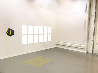
The timeline idea went down very well with the group however in relation to the wayfinding people thought that using text on the floor would get very crowded as the space is not that big so we should just stick to the timeline and use of line from the logo as a consistent theme throughout the exhibition. Another thing with the logo was the colours, they do not stand out enough, if we were to put posters up in these colours they do not really grab your attention enough. Also the colours of the wayfinding did not really fit in with the rest of the work shown below.

We then used gifs to experiment with referring to the space in a fun and inventive way. Shown below.


No comments:
Post a Comment