Wednesday 28 February 2018

MGM - JAPAN INITIAL DESIGNS / IDEAS

I started by looking at the mini leaflet and what i wanted to include on it and the designs. Before I could do this I realised that I needed an appropriate name for my scent for my diffuser. To do this I decided because I am not using Japanese symbols as they are overused I thought I could find out some words as Japanese words and see which I preferred. For the name I looked into words that related to my project, shown below :


I chose these five words as I wanted the theme to be strong throughout the project. As the traditional japanese music is all about the instruments which all work so well with each other and it has a soothing tone which allows the listener to rest and recuperate. Now that I had the name set I wanted to then focus on the information that was going to be on the leaflet. I wanted to keep it light and simple, One aspect that was very important was to include was the traditional aspects as I am trying to modernise them. I chose rest as visually that was the word that I liked the most.

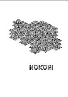
Initially in relation to the designs I started off by looking back over my visual research so that I could inform my practice. I started with a basic shape that I had come across and then repeated it over and over to get this :


I then played around with this to come up with some designs like this,, not only did I play around with the shapes but also the typeface. As I was not sure If the one that I have used above is fitting for this project and I think the second one used was better.


-

Sunday 25 February 2018

STREET FEAST POSTER DEVELOPMENT

As I have sorted out my colour scheme I just needed to have a strong design to start the campaign off. I have used the same theme throughout all my designs so that I keep a strong identity throughout the campaign. From my initial sketches I thought the concept wasnt quite there so I looked further into the venues and where they are.


I created this shape from the 4 venues as you can see on the maps above and thought this could be a god starting point for the concept having something that hints at where they are and having that brand identity in place. Before I started developing my designs I planned out what I wanted on each of the 4 posters. As this brief is all about the revamp for summer I thought I should make that clear on the posters so I want 'summer' written in big type on each with '2018' and 'What will you do with your summer' and I created the hashtag '#mysummerfeast as I thought I could use this alongside this with the social media aspects such as snapchat and instagram. 

For each poster 1 chose a colour from my final colour shceme as the main colour for the arrow shape I created from the venues. I chose it by going back over the images from the website and deciding which is the most appropriate. I also researched into the vibes of each of the venues to influence my typography, background and layout of my designs. The aim of the development of this stage was to get one design per venue that I like the most to then gather some feedback from my peers.

1 Giant robot - tropical - I tried and tested many different layout designs with all the aspects included, some of which are below


with the above image I tried out a small fun game I thought could work for their campaign however I dont think it works on the poster design so I have decided to just do it on my social media for the campaign. 


with the above images I don't think that they portray the same personality of the tropical that I want it to portray, I quite like the typeface I think that is quite tropical however at the moment I think it quite boring.


I will take the left one above forward to gather information and feedback about it. I think the background is more tropical however I dont think it looks quite right yet so I would like a 

2 model market - sophisticated - I wanted to use a type and pattern sort of vive to represent sort of great gatsby vibe as that is something I think of when sophisticated is said. 


The design I will take forward to my crit is below as I think it is the best mixture of all my deisgns above. I am quite happy with the way that this design has turned out and am excitedt to gether feedback on this.


3 Dinerana - funky / lively - I found this design the hardest one as funky can be percieved as something different by different people.

Because I found this the hardest one I got some feedback from a friend on my course before I took this further for my big crit feedback. She said that because of the strong yellow againt the turquoise the shapes look as if they are floating and doesnt quite look right. She also said that there wasnt that much going on so I should add another aspect to make it more interesting.


I ended up with this after my mini crit which I am still not 100% happy with but I think it will be good for me to get some more feedback from a wider group of people.

4. Hawker House - playful / mechanical - having looked at the photographs of Hawker house I thought the adjectives were an accurate representation, it does look very mechanical


Overall I think this is the best design to take forward. All in all I think I have a strong brand identity throughout and am excited to see what feedback I recieve :


I took all of this feedback in and edited my designs as shown below and I am quite pleased with the way they have turned out -


Saturday 24 February 2018

CALENDAR FURTHER EXTENSIVE RESEARCH


I looked extensively at the brand promotion that G F SMITH already have in place so I could get an idea of what sort of vibe they have so that I can create something similar for mine. I found that a lot of their products and the style of their work was very minamalistic yet very effective their brand promotion is so simple yet so effective. I really love the vibe they have. I thought the best thing to do was to also look at their past events to gather lots of information to inform my designs - 


Then looked into some calendar designs as a whole that i htought were more suited to my brief and maybe some that were a bit more out of the ordinary -