

I created this shape from the 4 venues as you can see on the maps above and thought this could be a god starting point for the concept having something that hints at where they are and having that brand identity in place. Before I started developing my designs I planned out what I wanted on each of the 4 posters. As this brief is all about the revamp for summer I thought I should make that clear on the posters so I want 'summer' written in big type on each with '2018' and 'What will you do with your summer' and I created the hashtag '#mysummerfeast as I thought I could use this alongside this with the social media aspects such as snapchat and instagram.
For each poster 1 chose a colour from my final colour shceme as the main colour for the arrow shape I created from the venues. I chose it by going back over the images from the website and deciding which is the most appropriate. I also researched into the vibes of each of the venues to influence my typography, background and layout of my designs. The aim of the development of this stage was to get one design per venue that I like the most to then gather some feedback from my peers.
1 Giant robot - tropical - I tried and tested many different layout designs with all the aspects included, some of which are below

with the above image I tried out a small fun game I thought could work for their campaign however I dont think it works on the poster design so I have decided to just do it on my social media for the campaign.

with the above images I don't think that they portray the same personality of the tropical that I want it to portray, I quite like the typeface I think that is quite tropical however at the moment I think it quite boring.


I will take the left one above forward to gather information and feedback about it. I think the background is more tropical however I dont think it looks quite right yet so I would like a
2 model market - sophisticated - I wanted to use a type and pattern sort of vive to represent sort of great gatsby vibe as that is something I think of when sophisticated is said.


The design I will take forward to my crit is below as I think it is the best mixture of all my deisgns above. I am quite happy with the way that this design has turned out and am excitedt to gether feedback on this.

3 Dinerana - funky / lively - I found this design the hardest one as funky can be percieved as something different by different people.


Because I found this the hardest one I got some feedback from a friend on my course before I took this further for my big crit feedback. She said that because of the strong yellow againt the turquoise the shapes look as if they are floating and doesnt quite look right. She also said that there wasnt that much going on so I should add another aspect to make it more interesting.

I ended up with this after my mini crit which I am still not 100% happy with but I think it will be good for me to get some more feedback from a wider group of people.
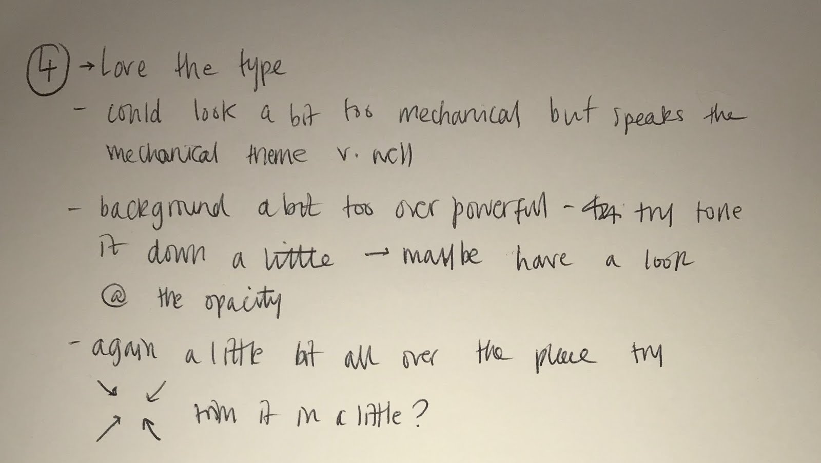
4. Hawker House - playful / mechanical - having looked at the photographs of Hawker house I thought the adjectives were an accurate representation, it does look very mechanical


Overall I think this is the best design to take forward. All in all I think I have a strong brand identity throughout and am excited to see what feedback I recieve :

I took all of this feedback in and edited my designs as shown below and I am quite pleased with the way they have turned out -


No comments:
Post a Comment