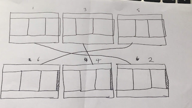

The figure above shows how I got my head around how I would need to layout the document and work out which page would go behind the next. I figured out where each tab would add on to the next and where there needs to be extra space in order for them to be glued in the correct position. This figure also shows the two sides in which the layout will be on.
The figure above clearly shows through the blue rectangles where the tab needs to be glued to the next to create the concertina layout. In order to create this layout the settings for the indesign document needed to be adjusted from what you would normally have for a booklet document.

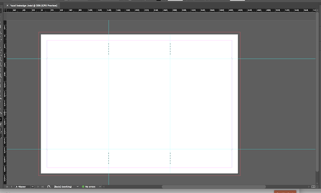
Rather than opening a normal booklet document I decided the best way for me to create this document would be to have individual pages that have guides on for both myself when I am designing the layout but also for Katherine when the binding process comes. I created the document with bleed, fold marks (the dotted lines) and he cut guides (the 4 'L' shapes in each corner by the guide lines). I did this in order to make the production process easier for Katherine to finish the booklet.
No comments:
Post a Comment