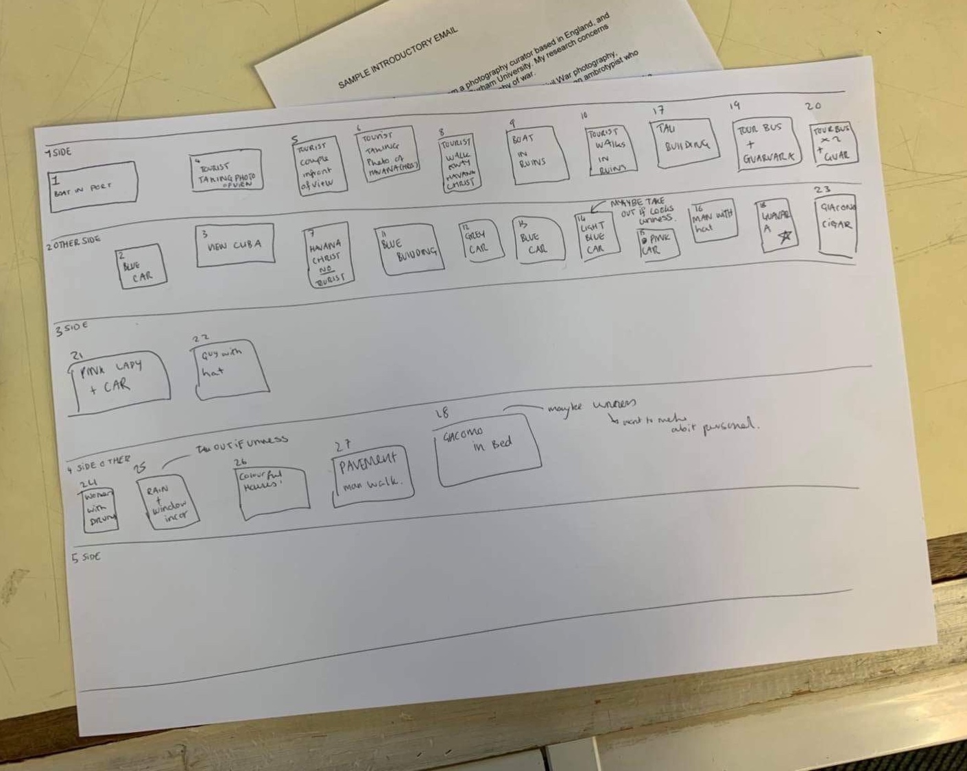
In order to keep the photos in the correct order, I asked Asia to write them down in a coherent way in which I will know exactly how she wants them, and see if they look good in the layout. Below is what Asia and I worked out together, the 1st column and the third column are one side of the concertina layout, and the 2nd and 4th column are the other side of the concertina. The different sides are representing the tourism and the other representing the distinct culture of Cuba through the eyes of Asia.
For this I decided to look at different ways in I can portray the message of how Asia is seeing Cuba for the first time, through the use of space and how that effects the way the audience is viewing the images :


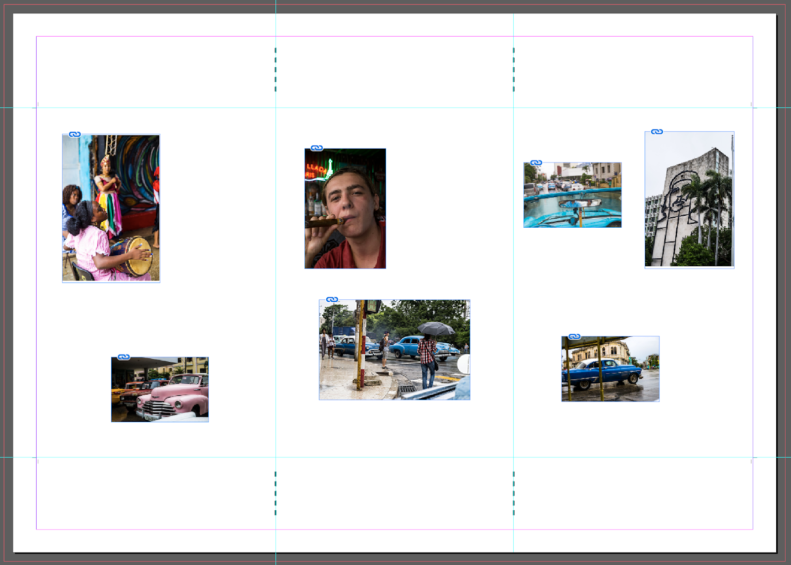
After having a play around with the layout in a random way, I decided it would be best to look at it in a more methodical way. I decided on some of Asia's images that they would look better and more to the theme if they were zoomed in on a specific area of the image. So I decided to look at that and play around with the images in this way :


Above you can see the brown box shape is the actual size of the image in the document but in reality I have chosen to zoom in on a singe section of the image in order to bring more life, and in some aspects zone in on the tourism aspect of the images. Due to the fact that Asia wants it to simply be photographs in the layout with no text, I went back to her to ask if she wanted anything else. Aspects of colour could be input throughout - to further back up the strong theme that is running throughout.
1
The first look I designed I decided it should be more of a ridged design that was more organised in a structural way, as I wanted to design different layouts that had contrasting features. I thought this could be a strong look for the tourism side as the tourists are very regimented and strict when they are in large groups. They are usually with a guide that is telling them what to do, where to go etc which could be reflected in the physical side of the layout, which is something that I tried below. I wanted the images to be in a block like format, taking up a lot of the page to mimic what the tourists are doing in Cuba - taking up a lot of the room. Below was the first experimentation :
The first look I designed I decided it should be more of a ridged design that was more organised in a structural way, as I wanted to design different layouts that had contrasting features. I thought this could be a strong look for the tourism side as the tourists are very regimented and strict when they are in large groups. They are usually with a guide that is telling them what to do, where to go etc which could be reflected in the physical side of the layout, which is something that I tried below. I wanted the images to be in a block like format, taking up a lot of the page to mimic what the tourists are doing in Cuba - taking up a lot of the room. Below was the first experimentation :


2
I then decided to experiment with space around each image, in order to make it look less busy and in your face. I also believe that if white space is used correctly it can create a sense of elegance and professionalism to the work at hand. In this case I believe it brings a sense of Cuba's change that is happening with tourism, making Cuba as a place change. I think that a lot of Cubans don't necessarily know about the change it is bringing and have tried to portray that trough the spaced out, a little confusing layout :


3
Then for the third experimentation I decided to have a difference between each side and have more of a contrast between the tourism and the culture aspects. As culture is based on Cuba as a place and Asia's take on it - it is a lot more personal. I have tried to represent this through the third design in order to give a clarity to which side is the more personal cultural side and which is the more impersonal side to her images.
The physical differences that I have tried to portray are more structural for the personal side, including aspects like having them spaced close together, as when you are close to something or someone it is considered as personal which was the logic behind my designing. For the more impersonal tourism side to the concertina book there is a lot more spacing to have some distance which relates back to my 2nd layout experimentation. Below is the third layout design that I produced to present in a crit and to Asia after that :


The 3 different layout experimentations I will be taking to a peer led crit in order to gather some feedback that I can use before I take them to Asia to see her thoughts on what is best and which she would like to take forward.
No comments:
Post a Comment