Below are my interpretations of drawing the word 'clock' in any sense or form in word document. I found this to prove an interesting task - was challenging but I just reminded myself that nothing could be wrong so do what ever I think is correct.
Tuesday, 7 February 2017
SB2 - MUSIC ILLUSTRATIONS
I chose 'time' for this task because my dad loves pink floyd and have listened to this song so many times since I can remember. I think that made this task harder, knowing the song. Because I need to look at the song in a new light rather than just listening. I need to listen and express what I can hear onto the paper. I found this task very interesting, however it took me a while to get pieces that I thought replicated the song well.
Sunday, 5 February 2017
STUDIO BRIEF 1 - FINAL OUTCOMES MINI EVALUATION
These are my final
outcomes, which I improved after the final crit I had the other day. I did
everything that was suggested in my crit. Below is my Final version of my map with the guide - they would be printed double sided. I decided as it was Light themed I would try and portray the way light goes from the source outwards, I achieved this with the background whilst still keeping the ongoing theme and using the colours of the 10 different zones.


Overall I have really
enjoyed this project, I believe it took me a while to get into it however I think
it once I started I loved playing around with the subjectivity of it. Not just
telling the audience where to go and why and when. My system is playful and
interactive due to the reflective vinyl and tape I used. The physical system of being on the floor and pointing in a rough
direction I think gives it another sense of playfulness and fun to it.
Saturday, 4 February 2017
POSTER EXPERIMENTATIONS
This was my final image that I decided to use of my paper creation out of folding technique. To create it I looked at many websites and youtube videos to get an idea and for this specific piece I followed a guide. From this I decided it looked like a building so I decided that my exhibition would be called 'INDUSTRIAL RETRO BUILD'. To develop my poster I looked at different layouts that I could use with the same colour scheme. My colour scheme is very bland and vintage looking to go along side the theme and with the name of the exhibition. In my eyes brown and these sort of colours are very vintage looking as I looked at vintage photographs and they are all in those colours. I didn't want the poster to look too crowded so I kept a lot of space around the image and text.
STUDIO BRIEF 1 - DEVELOPMENT PHOTOGRAPHS OF SYSTEM
As I was told in the crit I knew the mock up designs weren't enough to give the look and feel of the way finding system that I wanted. They do not portray the reflective sense at all. To do this I bought reflective tape and used a reflective jacket (with the reflective material cut out) and lay them down at a place that I needed and took photographs.


Considering the time I put into getting the correct material to take these photos they did not turn out as well I wanted them to because the reflective tape I bought didn't stick to the pavement which is why they do not look like straight arrows on the surface of the pavement.
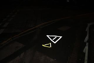
To improve my project further to get the look I wanted I went down to the print room and got a vinyl cut out for my silver section of my map. I then took them to an area in the dark to get the reflective look that I needed. I did this in response to my initial photographs not turning out well and I researched in what the best thing to do was in this sense to get the design outcome I wanted.


I think using the vinyl was a good decision because the images I got from this look a lot more professional and cleaner cut. However because I used the vinyl I was limited to either black or white reflective, luckily this white reflective vinyl looks like my silver section. So I used it for when you are in the Silver Zones looking to get around to the shows.
I personally do not believe that the photographs I took give the reflective vinyl justice for how it looked in real life, the vinyl is so much clearer and looks better than the tape but also a picture of the actual thing doesn't look as good as it does in context which is annoying as I could't show my outcome in any other way.


Considering the time I put into getting the correct material to take these photos they did not turn out as well I wanted them to because the reflective tape I bought didn't stick to the pavement which is why they do not look like straight arrows on the surface of the pavement.
To improve my project further to get the look I wanted I went down to the print room and got a vinyl cut out for my silver section of my map. I then took them to an area in the dark to get the reflective look that I needed. I did this in response to my initial photographs not turning out well and I researched in what the best thing to do was in this sense to get the design outcome I wanted.


I think using the vinyl was a good decision because the images I got from this look a lot more professional and cleaner cut. However because I used the vinyl I was limited to either black or white reflective, luckily this white reflective vinyl looks like my silver section. So I used it for when you are in the Silver Zones looking to get around to the shows.
I personally do not believe that the photographs I took give the reflective vinyl justice for how it looked in real life, the vinyl is so much clearer and looks better than the tape but also a picture of the actual thing doesn't look as good as it does in context which is annoying as I could't show my outcome in any other way.
Friday, 3 February 2017
STUDIO BRIEF 1 - FINAL CRIT
I got a lot of productive and positive
feedback from my final crit, however I got so much that I think I will need to
take extra time to make these improvements because it will just bring my whole
wayfinding project together in a much better final outcome.
In relation to my map I
asked in my crit whether my group thought that I would need anything to
accompany it because I was I know the map was ok but I wasn’t sure if it would
be enough to be as clear as I wanted my system to be. My group was helpful by
saying that they didn’t think it was enough because even though my systems has
two different parts to it, how were you meant to know what show was where and
at what time sort of thing. To move on from this I need to create a programme
sort of leaflet or something to go alongside the map and advance my wayfinding
system.
They also commented on
the design of my map asking why I chose the colour pink, this made me think and
I didn’t have an actual design decision for this choice so I thought it would
be best if I removed the pink and kept my map simple yet effective.
There was also a
suggestion to put the ‘LLN’ as separate letterforms into triangles. I will try
out this suggestion however I am not sure on whether it would look good as it
could overcomplicate the map and look of the page.
I also originally found
it hard to take the correct photographs with the correct lighting for the
result I wanted, it was suggested to me that I use the material on a reflective
jacket as well as the reflective tape that I purchased online to get the look I
wanted.
I went into the crit
wanting to know what I should do about my original mock up designs because they
took me a long time to produce on illustrator however they did not portray my
sign system well enough because I could get the colours to be reflective and
the angles were not working on the image well. To get over this issue it was
suggested to me that I should do line drawings on top of the images I took
around Leeds and then work out the angles that would look correct and then
layer the correct triangles on top. If this does not give me the loom I want
then I am going to have to go back to the places I took the images in and take
more photographs with the reflective material being placed out onto the
pavement in front of me.
Wednesday, 1 February 2017
EXHIBITION POSTER BRIEF, V&A EXAMPLES
The brief for this was to create an exhibition poster that featured either The Tate Modern, V&A or the Natural History Museum. It had to be A1 size and able to fold down into A4 size. Using folding techniques and folded card/paper to form sculptural object. Throughout this brief I am going to look heavily at layout and how the page reads. I will be looking at how the text fits on the page in relation to the images and space around them both. I am going to look at creating a poster for the V and A as I like a lot of the posters that they do already.
I then thought I would look at previous V&A posters to give me inspiration and see what has been made for them before. The first was a series of posters that I looked at for 'Disobedient Objects' These posters use ordinary objects to cause rebellion and protest therefore linking back to the title of the exhibition. I think these are very interesting and they visual aspect of the poster links heavily to the title which is something that I want to achieve.
The next V&A poster I looked at was for an exhibition called 'Get Closer'. Again I think the imagery and the visual aspect of the poster links so strongly to the title due to the contrast in scale of the man and the vase. I think the fact that this poster is monochrome makes the poster less eye catching as the only bit of colour is the logo.
Subscribe to:
Posts (Atom)


