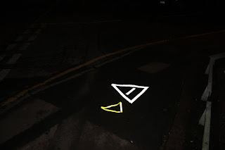


Considering the time I put into getting the correct material to take these photos they did not turn out as well I wanted them to because the reflective tape I bought didn't stick to the pavement which is why they do not look like straight arrows on the surface of the pavement.
To improve my project further to get the look I wanted I went down to the print room and got a vinyl cut out for my silver section of my map. I then took them to an area in the dark to get the reflective look that I needed. I did this in response to my initial photographs not turning out well and I researched in what the best thing to do was in this sense to get the design outcome I wanted.


I think using the vinyl was a good decision because the images I got from this look a lot more professional and cleaner cut. However because I used the vinyl I was limited to either black or white reflective, luckily this white reflective vinyl looks like my silver section. So I used it for when you are in the Silver Zones looking to get around to the shows.
I personally do not believe that the photographs I took give the reflective vinyl justice for how it looked in real life, the vinyl is so much clearer and looks better than the tape but also a picture of the actual thing doesn't look as good as it does in context which is annoying as I could't show my outcome in any other way.
No comments:
Post a Comment