ALL AS ONE BLOG - FOUND IT EASIER TO DO FOR THIS PROJECT - 1 LONG ONE
BRIEF


'Students’ lives are increasingly dominated by technology.' - something to think about throughout this brief
key messages Kitty and I gathered :
Student national art pass can help
you switch off, relax and find inspiration
A whole year of art for just £5
Things we could produce (deliverables) / include
- posters
- on campus stunts
- university intranets
- digital screens in lecture halls
- uni magazines - could we advertise in them
- social media
- art fund could partner with a
brand that resonates with students? drinks, food, nights?
- as its for students make it comical
Aspects to consider
- how can we make the release of the
art pass feel like an event?
- make the scale of the pass
obvious
- production budget is limited - how can we make everything low cost?
RESEARCHING ART FUND
The art fund website is very
simplistic, only showing the information that is necessary to the viewer much like the latest news, upcoming events, location finder for museums you have
access too, information about art works they have bought for the
country ect.
The design work for the various
elements of their digital sites are all very sleek and simplistic -
using strong primary colours to accompany the layouts and areas of
texts.
EVENTS
Because this is a student pass we need to advertise towards students, the brand has specifically wanted to be marketed in freshers fairs. Our stand needs to stand out from the rest. However the most common thing from a freshers fair is the free stuff and as we have a limited budget we cant really give out too much free stuff.Here is some research into freshers
fair stools and what we think is successful and unsuccessful.
When researching into freshers fairs -
we got images from universities all over the country. The fairs are
all very busy and disorganised, with much information being thrown at the
students - and therefore potentially confusing them.
All these of the images above show how chaotic
and busy freshers fairs can be, this helped me and Leah realise that
when designing the campaign for the Student Art Pass we needed to be more
selective of the information we chose for the students to view.
Stands
commonly found at these freshers fairs are sports teams, societies,
clubs, restaurants, socials and charities. Everyone is trying to endorse their
product to the young 18-23 year old naive students! Much like we should also do becuase our product will actually be worth while for all students to come and relax.
Because of this i decided to do some research into how to make you freshers fair or general campaign stand out / stuff along those lines :
I found out that having things like icebreakers or something fun there then usually you should be fine
TARGET AUDIENCE
The target audience for this pass would
roughly be 18-23 year olds. Students of this age are commonly interested
in engaging, memorable and potentially technological things . As we have access to young
students and the correct target audience. We were able to
conduct a small survey could help aid the direction of the campaign. Something that I believe is very good is that we have access to both art students and others at the university.
QUESTIONS WE ASKED:
- did you go to freshers fair? (yes
or no)
- why?
- what was your most memorable
aspect of the freshers fair?
- which stool did you engage with
the most and why?
- would you go back if you weren't
in first year?
- did you engage with stools that
weren't necessarily for your topic?
These were the results, we concluded that most people do go to freshers fairs even if they are not a fresher, however because we have students answering the questionairre it not always the most helpful thing. we are lucky that we got positive results, however if they were negative we were prepared - as that is the whole reasoning behind doing this survey. If we found out that noone actually we to freshers fairs then we would start a mini event / activity to advertise Art Fund instead.
OTHER LAUNCHES
As the brief asks how could we make this campaign like an event realease we decided to do some research into other launches and how they have made their company great.
- Ted Baker
used social media to reach out to the public, by releasing daily
clues on its Instagram account (like a guessing game).
- Castmemarc is a hashtag devised by Marc Jacobs and his marketing team to find the models via Instagram for his latest campaign
- Hermes - an
interactive video taking customers on a tour of their house of
scarves.
- Chanel -
"Inside Chanel" is a microsite dedicated to telling
the story of the brand. 12 chapters combing photography,
animation, sketches and video showing insight into the
brand.
RESEARCH INTO SUCCESSFUL
CAMPAIGNS THAT HAVE USED SMALL BUDGETS
1. use social network
to your advantage - its free. There are many sites; Facebook,
twitter, linkedin, Pinterest, instagram ect.
2. Infographics
= eye candy.
3. guerrilla
marketing - cheap and easy, there is also a lot of room for creativity
here - limited boundaries ect.
4. email
marketing - (leeds uni offers you too send an email out too all
of their 40,000 staff and pupils for only £200)
FRESHERS FAIR STAND
The main aim will be to make it to the unis in the larger cities as there are more students. At the freshers fair we can also promote the exisiting app that Art Fund have as it is has a map where you can locate the galleries. Also because most of the target audience are always on their phones.
The concept for the hanging
behind the stand is a large image of the UK with small light up LED
lights representing the location of where Museums and Galleries are
that are included in the £5 pound Art Fund card.
At the freshers fair both Kitty and I believe the strong use of imagery is most effective as there are so many people there who are walking past and they would rather look at a picture rather than a load of writing.
SURVEY ON THE PASS
1. Would you
use an Art Fund card?
2. Would it
relate/ benefit your course?
3. Do you
know what it is?
4. Is it
worth the £5?
5. Have you
ever seen it advertised?
From this small survey
of people that are from a range of different courses, Leah and I gaged that the
general feel towards the future student art card was very positive. People
that hadn't heard of it and weren't interested in art seemed
interested in this opportunity. This is due to the fact that the card offers
museums and galleries and would further the education opportunities of the
students that it would be available too.
RESEARCH FROM THE PROJECT
PACK INTO CONCEPTS AND IDEAS
The project pack as well as providing colour inspiration, also
provided a general direction that they wanted us to take the launch of their
card, using meme, and seeing the humorous side to art in order to appeal
to the younger audience.
SOME MORE INITIAL IDEAS
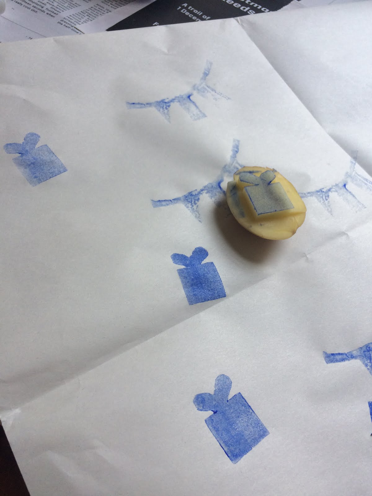
I thought to get all the rubbish ideas out my head before grasping the best one possible to make up some quick mock ups to show kitty of some posters / card design / facebook
FURTHER RESEARCH
Thought I would look into some countdowns, the general feel of the art pass and some poster research as I will be designing the posters.
COMPANY TO PARTNERSHIP WITH
On the brief it says to think about a possible company that the Student At Pass could join with. I did some quick research and Kitty and I came up with teapigs:
The reasoning behind this was because this brief is all about going to a gallery even if you are not an art student, you can go there to have a break and relax. What else goes hand in hand with an British Art Pass than a lovely cup of tea? Nothing.
MONEY SAVING
As this is a minimal budget I think the best way to do this campaign is fully digitial which is probably the perfect fit for this brief because the target auidiene are alway on their phones anyway!
PROJECT PACK COLOURS
These below are the
14 colours provided by art fund, we are allowed to use all of them,
or 1 of them, its up to us as the designers.

From this I decided to use the 4 pastel colours and the 4 main colours for the poster designs ( the bottom row)
The project pack as well as providing colour inspiration, also provided a general direction that they wanted us to take the launch of their card, using meme, and seeing the humorous side to art in order to appeal to the younger audience.
INITIAL THOUGHTS
As one of my tasks for this brief is creating posters I thought I could include the humorous aspect by using memes or a play on artists names to appeal to our target audience.
In order to advertise our pass across different social media platforms I thought we should have one common factor throughout creating a strong brand identity. In this case because of my research I found the best way to be creating a memorable hashtag... #ArtFUN #ArtMeUp #ArtIsLife #ArtForAll are some initial thoughts I had.
For the rest of the social media platforms I want to again promote brand identity but I thought the best way to do this was to utilise the posters I will make and promote our collaboration with tea pigs.
POSTER INITIAL TESTS
TEXT TEST
BEFORE CRIT
CRIT
AFTER CRIT
FINAL
SNAPCHAT
FACEBOOK
TWITTER
MOCK UP POSTERS


I personally am very happy with my outcomes for this brief as I think I have achieved a high level of professionalism across the range of this campaign.
Alongside this I have also been able to add the fun aspect so that the designs are tailored well and correctly to our target audience. I think this was defiantly helped being the same age as the target audience and by having so many other students around us to soak up and gather information from them.
Something that Kitty and I had to focus on and keep reminding ourselves in this brief was the budget. In some senses, it was a bit limiting as we did not want to be unrealistic with the task so we had to stick to purely digital as it the cheaper way. However, I think it would have been fun experimenting with other processes.
SHOWING OUR SUBMISSION


