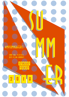
Feedback gathered -
- all the colours work really well and visually they look great
- the shape in some of them can look a bit overpowering - do you need it
- the font on the turquoise poster is very inviting, friendly and fun which is good for this type of event as it sums up its atmoshere
- maybe rejiggle / have a look back at the composition for the turquoise and orange one ( in relation to the text) recompose it in the way that you would want to catch your eye first - maybe important from top to bottom?
From this I made some small adjustments as shown in my final poster designs below -


No comments:
Post a Comment