Sunday, 30 October 2016

OUGD403 Studio brief 02 - Starting Ideas, Rationale then Concept Crit


Initial Ideas

My initial ideas are all based on my adjective delicate - to start designing I looked at the synonyms of delicate. This helped me to try and translate the adjective into my designs for the typeface.


Rationale 1 idea -
Looking at putting characteristics from Baskerville onto Helvetica. Characteristics like the high contrast in thick and thin strokes, graceful bracketed serifs with flat bases. It would be interesting to add character and more fun to it going against its original characteristics and have more personality. I could translate the personality of the word by making the weight thinner overall.


Rationale 2 idea -
Creating gaps in the lettering resembles something which is close to breaking showing me that it is fragile, dainty and delicate. Looking at Baskerville, keeping the serifs yet making them flat based to add character, using lowercase to make it look more feminine whilst adding higher contrast in weights.


Concept Crit -


The pictures above are what we started with in the concept crit. On the left the tutors first told us to make small images of what we thought our adjectives looked like. I decided that flowers represented the word delicate very well. The dainty leaves with light strokes showed the delicacy well. We then went around our table and gave our sheet to the person next to us to see what they thought our adjective could be represented by, thus helped me a lot because it gave me a sense of what my peers thought as well as me. Then the last image on the right we then had to add a sentence to our drawings to give it a small explanation. This gave me a couple of different views which was useful.

The concept crit really helped me because it opened my eyes up by just thinking about the possible ideas and different routes I could go down. However the thing that helped me the most was the feedback I got from my peers -


From reading the feedback, I thought I would carry idea 1 forward by experimenting with Helvetica by adding characteristics from Baskerville and having a higher contrast in weight to give it more character. However I still really like my idea of breaking up the lettering to make it more fragile. 

Thursday, 27 October 2016

OUGD403 Studio brief 02 - Typeface research


 Müeller-Brockmanns Typefaces


Garamond


This design was created by Claude Gammond. There was also an adobe version created in 1989. Characteristics of this typeface include; large counters in the a and e, long ascenders and descenders, horizontal crossbar, f has a strong hook, diagonal top serifs slanting towards left. Garamonds characteristics were all influenced by calligraphy. It has been used by companies such as Apple, Google, Abercrombie and Fitch and Dr Zeus. The use of serifs in this typeface suggest traditionalism, formality and are very easy to read because the serifs are what guides our eyes across the text. Due to the lack of pointed corners and curves between necks, bowls and serifs I believe that this is an elegant typeface.


Caslon
Caslon was made by William Caslon. He was well recognised because of his accuracy in typography in the 18th century. This typeface was designed to have an organic structure which resembles handwriting. It was popular in the time that it was created and particularly used for body text and printing books. The characteristics include; C has double serif, big loop on k, T has long serifs and thin arms, lower at centre, bowl curve of italic p overlaps stem, high, horizontal crossbar of e, long arm on L, bottom arm longer on Z. I think this typeface is quite friendly because of how rounded it is.
Baskerville
Bodoni
Berthold


Baskerville, is most known for its crisp edges and high contrast in strokes, was designed in 1754. The typeface was heavily influenced by the processes and printing.  Baskerville was illiterate but learnt how to write and became very interested in calligraphy, and practised handwriting and inscription that was later echoed in strokes and embellishments in his printed typeface. Characteristics include, J well below the baseline, high crossbar, top and bottom serifs on C, tail on lowercase g is open, long lower arm of E, T has wide arms and many versions feature a calligraphic J. The sharp serifs make the typeface very clean and harsh. 


The Bodoni font was named after its designer, Giamattista Bodoni (1740-1813) who was often revered as the King of Printers. It is a series of serif typefaces following the ideas of John Baskerville, as found in the printing type Baskerville. It is a series of serif typefaces following the ideas of John Baskerville, as found in the printing type Baskerville. It was of increased stroke contrast and a more vertical, slightly condensed, upper case but taking them to a more extreme conclusion. Characteristics include; small x-height, vertical stress in rounded strokes, J has a slight hook, double storey a, extreme contrast between thick and thin strokes and one R with straight tail and one with curved tail. Bodoni is a more expressive typeface due to the contrast and also the lack of bracketing in the hairline strips. Due to this I believe this is more of a display text.


Clarendon


Named after Oxford’s Clarendon Press, the popular slab-serif was created in 1845 by Robert Besley for the Fann Street Foundry. Notable as one of the last new developments in nineteenth century typography, the letterforms represented a significant change from the slab-serif Antiques and Egyptians that were so popular in that time.  Becoming a popular wood type, Clarendon is also notable as a common choice on ‘WANTED’ signs of the old west. Characteristics include; vertical stress, tall x-height, slab serif, low contrast in stroke and strong bracketed serifs. It has a heavy weight and slab serif make it a hard to ignore typeface which is why it is used to grab attention on things like posters.


Designed by H. Hoffman, H. Berthold initially released Block in 1908. H. Berthold also released subsequent versions reworked by Hoffman through 1926. With its distinctive bold characters and very short descenders, Block was a staple for job printing in Germany for decades. In the late 1970s, H. Berthold added weights, including italics, to offer more flexibility. Characteristics include; thick strokes with low contrast, short descenders, not consistent rules and sans-serif. It is an expressive typeface, the heavy weight and continuous stroke make it again a loud and informative typeface.


Times


Based on the 12-point size of Times Roman, the Linotype version of Monotype's Times New Roman. Very formal and serious appearance with serifs and contrast. Characteristics include; serif, short ascenders and descenders, highly readable, high contrast and economical use of space.

Helvetica


Helvetica was developed in 1957 by Max Miedinger with Eduard Hoffmann at the Haas’sche Schriftgiesserei (Haas type foundry) of Münchenstein, Switzerland. It was a redesign. The aim of the new design was to create a neutral typeface that had great clarity, had no intrinsic meaning in its form, and could be used on a wide variety of signage.


Helvetica is ubiquitous, simple looking and neutral. Its based on the idea that type should have no meaning, and is therefore ambiguous. It is useful in portraying different message with slight changes to alterations such as kerning, alignment and weight but may not take well to modifications of the actual form and structure of the letters.

Helvetica was used in a lot of companies that were varied, showing it was a typeface that has the characteristics of being easily read and clear which also meant that it could easily be manipulated to fit for the specific company for different purposes. It is quite a modern looking typeface maybe due to it being sans-serif. Some companies that use ti include; American Apparel, The North Face, Skype, Microsoft, Jeep and American Airlines.


Univers


Univers is the name of a realist sans-serif typeface designed by Adrian Frutiger in 1954. Originally conceived and released by Deberny & Peignot in 1957, the type library was acquired in 1972 by Haas. Then transferred into the D. Stempel AG and Linotype collection in 1985 and 1989 respectively upon the Haas'sche Schriftgiesserei (Haas Type Foundry) acquisition and closing.
Univers is one of a group of neo-grotesque sans-serif typefaces, all released in 1957, that includes Folio and Neue Haas Grotesk (later renamed Helvetica). These three faces are sometimes confused with each other, because each is based on the 1898 typeface Akzidenz-Grotesk. These typefaces figure prominently in the Swiss Style of graphic design. 
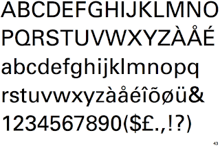
Characteristics include the tail of a and the top of l are less rounded, the arm of k join at the stem, the tail of r is curved, the y has a straight descender and the top of the t is angled.
Univers has a ver 'normal' look. This is because it is sans-serif, has a very low contrast in the strokes, and has horizontal terminal cuts which look logical. This would also makes me think of the typeface as being contemporary in its design and use.

Wednesday, 26 October 2016

OUGD403 Studio brief 01 - Evaluation


Evaluation


When I first received the word Lockram I had no idea what it was so I started research, into what it was and the history behind it, not only this but reading Massimo Vignelli’s The Vignelli Canon really helped me. Vignelli's graphic design work has a deceptive simplicity to it. I wanted to combine this in my work by keeping my logo classy simple. With this in mind from my research I chose to develop my designs for a high end French inspired Fashion brand much like Chanel. 
I think overall my approach to the brief could have been improved because I spent a lot of time researching not just designing which in hindsight was not what I should have done. I should have spent more time doing sketches before doing my logo on illustrator. This will help me for my future projects because I will manage my time better and do the sketches first. I also believe that due to my little knowledge of illustrator this prohibited my full potential whilst creating my outcomes - it took me a while to get the feel of it, however this is what was needed and I am glad I am now using it.
I found studio brief 1 to be an exciting project learning about new things such as kerning which helped me hugely to understand the design process of logotype and how it all effects the end design. What I found most interesting was researching about branding as a whole and how designs are effected by little things such as serifs.

OUGD403 Studio brief 01 - Final Crit


Final Crit


Before my final crit I went with 4 questions I asked myself - 


Who is the company?
- A french luxury brand of fashion and linen cloth

What do they do?
- clothing store, selling high end fashion items

Who is the target audience?
- mainly going to the middle / upper class
- wealthy people looking to splash out some money 

Where will the logo appear?
- shop fronts, signs, labels on clothes and bags

When researching luxury, high brand fashion logos and signs I saw they were all BOLD and 
s p a c e d out to show the importance and wealth of the brand. 


The feedback I got from the crit --

- The logo with the box around it makes it too enclosed and refined adds a sense of structure which is not what you want from a brand like this
- My favourite design above was told to be delicate but confident 
- There has been thought been put into this, it is very minimal and art deco
- too clean

Analysis --

- I think I could have spent too much time researching the different companies on my Pinterest page which could have taken away from the designing aspect of it
- However I really like the end design that I have produced 
- To go further I think I would need to add more personality to keep it away from being so clean - to do this I could of added serifs 
- In future I think I should try and manage my time better to do more designs
- Overall, the feedback will help me with future briefs to think deeper about the target audience and their tendencies or personality traits when buying products.

Sunday, 23 October 2016

OUGD403 Studio brief 01 - More development and mock ups


Designs


Here are some more of my designs, looking closely at the shadowing again - the gold I thought would portray a sense of elegance and wealth that goes well with the company. Even though the gold portrays a sense of wealth I think the black shadowing works well with the actual logo design because it makes it bolder however on little labels and tags it could get hard to read.
All of my mock ups have my final designs on - they are what I think is the right sort of designs for my company, having elegance and simplicity. On all of them I feel like I have an even composition.
The logo on the shop front underneath is probably one of my favourites due to the fact it is simple and works well, makes the type look as if it is coming off the page. 

I want to go into my crit getting lots of feedback about why my designs do or don't work and hopefully that is what I am going to gain.


Saturday, 22 October 2016

OUGD403 Studio brief 01 - Further design ideas


Further Designs


I focused on making a contemporary logo having minimal detail and making small adjustments to the type I used. The end product is that my logo design will be put onto a label, poster and shop front. I wanted my simplistic design to also portray high quality and class. The uppercase letters appear to me as more contemporary as each letter has the same baseline and the same cap height - this is what simplifies it because it has uniform.


Consistent kerning suggesting reliability, very simple, powerful and easily recognised logo. I looked at rounding the letters to make it less harsh which was suggested to me in my crit. I also tried some shadowing techniques. My two favourites from the above are the 1st and the 4th - however in the 4th logo the lettering is not rounded - after I round the lettering I think it would be much better and give it a look that invite the upper class into the store.

Tuesday, 18 October 2016

OUGD403 Studio brief 01 - initial logo ideas and Feedback


Logo Ideas


Originally I wanted to play around with the 'lock' word in lockram but after I looked at intertwining the O and the C to create a sense of it being locked - however it didn't look like high end fashion at all it looked more like a normal store you would go an get DIY kit from. So then I played around with the kerning to see if that would change the appearance of my logo to have the look that I wanted - however I think it was the O and the C connected that made it have the look that I didn't want.

After playing around with the O and C I thought I would go back to basics because it looks more upper class - in a shop like this less is more. I also made sure that the kerning was a lot wider because in all of my research the lettering is all very spaced out which it what I wanted. I think the lower designs look very elegant and simple and also make it easier to read and shows the importance with the bold big spaced out letters. The uppercase lettering also gives it a sense of dominance.


I then looked at putting a border around the word because I looked into the white company logo however I wasn't sure about it for my logo due to the fact when I first created it, it reminded me heavily of a vintage barbers sort of look, without having the class that I needed.


                                                     Feedback from my crit 
- the lettering looks very sharp and harsh
- the kerning is a good spacing and it does look like your research
- stay away from the locked O and C - not the look you should be going for in high end fashion


Friday, 14 October 2016

OUGD403 Studio brief 01 - Research into similar Companies


I chose to move away from the medieval small shop idea I originally had and moved onto European High End fashion sort of brands because it was a linen fabric that came from France. To do this I would target upper to middle class ladies that have enough money to shop for pleasure without looking at the price.


All of the high end fashion designs above give off a sense of class and meaning.  I noticed from all the brands such as GUCCI, CHANEL and CELINE the kerning and the capital letters are what make it look powerful and high end. I wanted to recreate this sense of power, the ladies who shop in Lockram will be powerful ladies with money and they want where hey shop to represent them.


My logo design will have to be adaptable because it will be used in many different media's including apps, websites, store fronts, billboards and magazines. Having the sense of elegance and class is going to be my main focus for my design because otherwise I will not get the clients that I am looking for.  


OUGD403 Studio brief 01 - Research into Vignellis Typefaces

Helvetica 


Helvetica was developed in 1957 by Max Miedinger with Eduard Hoffmann at the Haas’sche Schriftgiesserei (Haas type foundry) of Münchenstein, Switzerland. It was a redesign. The aim of the new design was to create a neutral typeface that had great clarity, had no intrinsic meaning in its form, and could be used on a wide variety of signage.


Helvetica was used in a lot of companies that were varied, showing it was a typeface that has the characteristics of being easily read and clear which also meant that it could easily be manipulated to fit for the specific company for different purposes. It is quite a modern looking typeface maybe due to it being sans-serif. Some companies that use ti include; American Apparel, The North Face, Skype, Microsoft, Jeep and American Airlines.


Century


I chose to look at the Gothic version of century because I enjoy its characteristics more, it is a sans-serif typeface in the geometric style, released by Monotype Imaging in 1991. It is strongly influenced by the font Futura, though with a higher x-heightLike many geometric sans-serifs, Century Gothic's design has a single-story "a" and "g", and an "M" with slanting sides resembling an upturned "W". Its uses include the Ellen DeGeneres Show, Battlefield Heroes, GMA network and Samsung ATIV.


Garamond


Claude Gammond designed the original design. These designs have been the basis for many modern versions of Garamond. Robert Slimbach created the Adobe version in 1989. They have large counters in the a and e, horizontal crossbar, long ascenders and descenders, f has a strong hook, diagonal top serifs slanting towards left. Garamonds characteristics were all influenced by calligraphy. It has been used by companies such as Apple, Google, Abercrombie and Fitch and Dr Zeus. As a whole the typeface I think is authentic, elegant and quite traditional.


Futura


Futura was inspired by the Bauhaus design style, designed by Paul Renner in 1924. It was first intended to be used for body text for books, because it is seen to be very clear and easy to read, it is commonly used in headlines in advertising. As a typeface it has many characteristics such as a low cross bar, the 'o' is a perfect circle, the counterspace is circular, it has pointed apex and the ascenders rise above the ascender line. It has been used in companies such as HP, Volkswagen, Ikea, Absolut Vodka, Crayola and Supreme. As a whole I like the typeface however I think it is very generic and possibly too clean.

OUGD403 Studio brief 01 - Research into given word


LOCKRAM


Definition >  
A kind of linen cloth anciently used in England which was originally imported from a small town in Brittany.


History >
From Locronan a small town in brittany where it was said to be originated, a linen fabric that was shipped over to England. At first when I researched it, it was said to be a course linen fabric which made me think of a scruffy sort of small clothing shop in Brittany with an orthentic sort of look for it.


Initial thoughts for design >
Initially I thought I could create a little shop from a small town in Brittany where lockram was created a while ago. because lockram was shipped over a while a go I thought I could do a sort of medieval looking logo design. However I found it hard to research such things in Brittany so i thought I would change my design idea to look more into the linen area of clothing. My thoughts when it came to linen was that it was more upmarket and had a upper class look about it. 


My interpretation of the brief -  to create a logo by changing the characteristics of a chosen typeface out f 6 to work in a specific word. The function being to work in the background of what we want it to be based on using the personality of the letters using the kerning, stroke, weights, serifs and scale. 

OUGD403 Studio brief 01 - Given Word


My word was 'lockram'.

The definition that came with it was 'a kind of linen cloth anciently used in England originally important from Brittany'.

When I first saw this word I found it difficult to think of what sort of company I could do but then looking at the definition I thought i could just do a clothing company - possibly french clothing company?

My only other idea that first popped into my head was to look at the use of lockram in the ancient times - looking more into Medieval sort of era and looking at how typography was back then.

Tuesday, 11 October 2016

OUGD403 - Kerndown


Kerning exercise -


Kern Definition -
PRINTING
verb
gerund or present participle: kerning; noun: kerning
1adjust the spacing between (characters) in a piece of text to be printed.

We were in a group of 6 and the aim of the task was to produce a logotype design focusing on how the kerning affects what you perceive the logotype to represent. We were given 5 companies; a luxury car company, a basic shopping brand, a condom company, an indie band and an IT company.

- luxury car company - clean cut and aligned type to have a sleek and high end expensive with the kerning close together to show its importance


- basic shopping brand - we decided to go with this because of the angled 'Z' seemed cheap which represented what is sold in the shop and having next to no kerning at all doesn't seem professional. 


- a condom company - this arrangement of the letters is fun and upbeat which is keeping up with the younger generations and the kerning being the same short distance is a different way of presenting the brand.


- an IT company -  straighforward, same baseline fro the IT company keeping it simple and easy to read and reliable which is exactly what is needed from this comapny


- a condom company - the kerning being still quite close together shows to me that it is safe which could even give the sense that the company is safe which is exactly what you want from this company. It also has a contemporary arrangement which is fun and playful.

OUGD403 Study task 01 - Ligatures


The objective of the group task we were set was to create a 'ligature' like an emoji to represent a phrase or a word that we use today. In my group we chose the phrase 'Awkward silence' because we felt that there wasn't anything that portrayed the sense of an awkward silence. The biggest challenge over the 3 days of this project was finding out the universal perception of an awkward silence - this is due to the fact that everyone finds different things awkward. 


To help us come to a conclusion of what would be universally recognised we went round fellow students and asked them to draw / write down their personal perception of what awkwardness / an awkward silence was. All the outcomes were completely different ranging from awkwardness in relation to their own body imagine, social experiences and many others. We struggled with our results because we were not sure how to put this into one specific image.


We then went online and did some research, looking at the symbols that came up when we search awkwardness and other words / phrases close to this. After looking and researching for a while we decided that the line of interest that we liked the most was the concept of a break in a conversation and loading as an idea of waiting for the next conversation to start.