Müeller-Brockmanns Typefaces
Garamond

This design was created by Claude Gammond. There was also an adobe version created in 1989. Characteristics of this typeface include; large counters in the a and e, long ascenders and descenders, horizontal crossbar, f has a strong hook, diagonal top serifs slanting towards left. Garamonds characteristics were all influenced by calligraphy. It has been used by companies such as Apple, Google, Abercrombie and Fitch and Dr Zeus. The use of serifs in this typeface suggest traditionalism, formality and are very easy to read because the serifs are what guides our eyes across the text. Due to the lack of pointed corners and curves between necks, bowls and serifs I believe that this is an elegant typeface.
Caslon
Caslon was made by William Caslon. He was well recognised because of his accuracy in typography in the 18th century. This typeface was designed to have an organic structure which resembles handwriting. It was popular in the time that it was created and particularly used for body text and printing books. The characteristics include; C has double serif, big loop on k, T has long serifs and thin arms, lower at centre, bowl curve of italic p overlaps stem, high, horizontal crossbar of e, long arm on L, bottom arm longer on Z. I think this typeface is quite friendly because of how rounded it is.
Baskerville
Bodoni
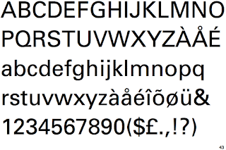
Berthold
Caslon was made by William Caslon. He was well recognised because of his accuracy in typography in the 18th century. This typeface was designed to have an organic structure which resembles handwriting. It was popular in the time that it was created and particularly used for body text and printing books. The characteristics include; C has double serif, big loop on k, T has long serifs and thin arms, lower at centre, bowl curve of italic p overlaps stem, high, horizontal crossbar of e, long arm on L, bottom arm longer on Z. I think this typeface is quite friendly because of how rounded it is.
Baskerville
Bodoni
Berthold


Baskerville, is most known for its crisp edges and high contrast in strokes, was designed in 1754. The typeface was heavily influenced by the processes and printing. Baskerville was illiterate but learnt how to write and became very interested in calligraphy, and practised handwriting and inscription that was later echoed in strokes and embellishments in his printed typeface. Characteristics include, J well below the baseline, high crossbar, top and bottom serifs on C, tail on lowercase g is open, long lower arm of E, T has wide arms and many versions feature a calligraphic J. The sharp serifs make the typeface very clean and harsh.

The Bodoni font was named after its designer, Giamattista Bodoni (1740-1813) who was often revered as the King of Printers. It is a series of serif typefaces following the ideas of John Baskerville, as found in the printing type Baskerville. It is a series of serif typefaces following the ideas of John Baskerville, as found in the printing type Baskerville. It was of increased stroke contrast and a more vertical, slightly condensed, upper case but taking them to a more extreme conclusion. Characteristics include; small x-height, vertical stress in rounded strokes, J has a slight hook, double storey a, extreme contrast between thick and thin strokes and one R with straight tail and one with curved tail. Bodoni is a more expressive typeface due to the contrast and also the lack of bracketing in the hairline strips. Due to this I believe this is more of a display text.
Clarendon

Named after Oxford’s Clarendon Press, the popular slab-serif was created in 1845 by Robert Besley for the Fann Street Foundry. Notable as one of the last new developments in nineteenth century typography, the letterforms represented a significant change from the slab-serif Antiques and Egyptians that were so popular in that time. Becoming a popular wood type, Clarendon is also notable as a common choice on ‘WANTED’ signs of the old west. Characteristics include; vertical stress, tall x-height, slab serif, low contrast in stroke and strong bracketed serifs. It has a heavy weight and slab serif make it a hard to ignore typeface which is why it is used to grab attention on things like posters.


Designed by H. Hoffman, H. Berthold initially released Block in 1908. H. Berthold also released subsequent versions reworked by Hoffman through 1926. With its distinctive bold characters and very short descenders, Block was a staple for job printing in Germany for decades. In the late 1970s, H. Berthold added weights, including italics, to offer more flexibility. Characteristics include; thick strokes with low contrast, short descenders, not consistent rules and sans-serif. It is an expressive typeface, the heavy weight and continuous stroke make it again a loud and informative typeface.
Times

Based on the 12-point size of Times Roman, the Linotype version of Monotype's Times New Roman. Very formal and serious appearance with serifs and contrast. Characteristics include; serif, short ascenders and descenders, highly readable, high contrast and economical use of space.
Helvetica

Helvetica was developed in 1957 by Max Miedinger with Eduard Hoffmann at the Haas’sche Schriftgiesserei (Haas type foundry) of Münchenstein, Switzerland. It was a redesign. The aim of the new design was to create a neutral typeface that had great clarity, had no intrinsic meaning in its form, and could be used on a wide variety of signage.
Helvetica is ubiquitous, simple looking and neutral. Its based on the idea that type should have no meaning, and is therefore ambiguous. It is useful in portraying different message with slight changes to alterations such as kerning, alignment and weight but may not take well to modifications of the actual form and structure of the letters.
Helvetica was used in a lot of companies that were varied, showing it was a typeface that has the characteristics of being easily read and clear which also meant that it could easily be manipulated to fit for the specific company for different purposes. It is quite a modern looking typeface maybe due to it being sans-serif. Some companies that use ti include; American Apparel, The North Face, Skype, Microsoft, Jeep and American Airlines.
Univers

Univers is the name of a realist sans-serif typeface designed by Adrian Frutiger in 1954. Originally conceived and released by Deberny & Peignot in 1957, the type library was acquired in 1972 by Haas. Then transferred into the D. Stempel AG and Linotype collection in 1985 and 1989 respectively upon the Haas'sche Schriftgiesserei (Haas Type Foundry) acquisition and closing.
Univers is one of a group of neo-grotesque sans-serif typefaces, all released in 1957, that includes Folio and Neue Haas Grotesk (later renamed Helvetica). These three faces are sometimes confused with each other, because each is based on the 1898 typeface Akzidenz-Grotesk. These typefaces figure prominently in the Swiss Style of graphic design.
Characteristics include the tail of a and the top of l are less rounded, the arm of k join at the stem, the tail of r is curved, the y has a straight descender and the top of the t is angled.
Univers has a ver 'normal' look. This is because it is sans-serif, has a very low contrast in the strokes, and has horizontal terminal cuts which look logical. This would also makes me think of the typeface as being contemporary in its design and use.
No comments:
Post a Comment