Thursday 9 February 2017

405 MODULE EVALUATION

Throughout this module I have accumulated new skills and knowledge that has and hopefully will keep on impacting my design. I have found in this module that the InDesign workshops are very helpful. I have also found out that if you do not keep on using the skills you learn they are very easy to forget. The workshops we had at the start were incredibly useful but I know there is so much more to learn. However now I am at the end of the module, making a zine seemed like a hard task complete without looking back at my notes from the workshop and getting help from the technicians. 

During this module I have looked extensively at subjectivity and objectivity. The introduction of practical and conceptual approaches and how the process effects the outcome. In studio brief 1 we were taking a very objective matter (a way-finding system) that is there for a purpose. We were told to challenge this but trying to include a subjective aspect into the brief. To me subjective art is very personal and it is something that is different to each person. I think I added subjectivity into my brief well because I made my system very playful and it it not tell you specifically where to go, yet it only suggests where you could go and it tells you the rough amount of time it would take you to get there.

Before this module making informed design decisions with purpose was not one of my strengths, I found it hard to make a decision without going back on it and changing my mind. This effected my work greatly due to the fact that I then had less time to actually design. Now I am starting to take more care and think about why I am making the decisions that I make, however I believe I still have to work on explaining why I had those design decisions not just doing them I need to explain. 

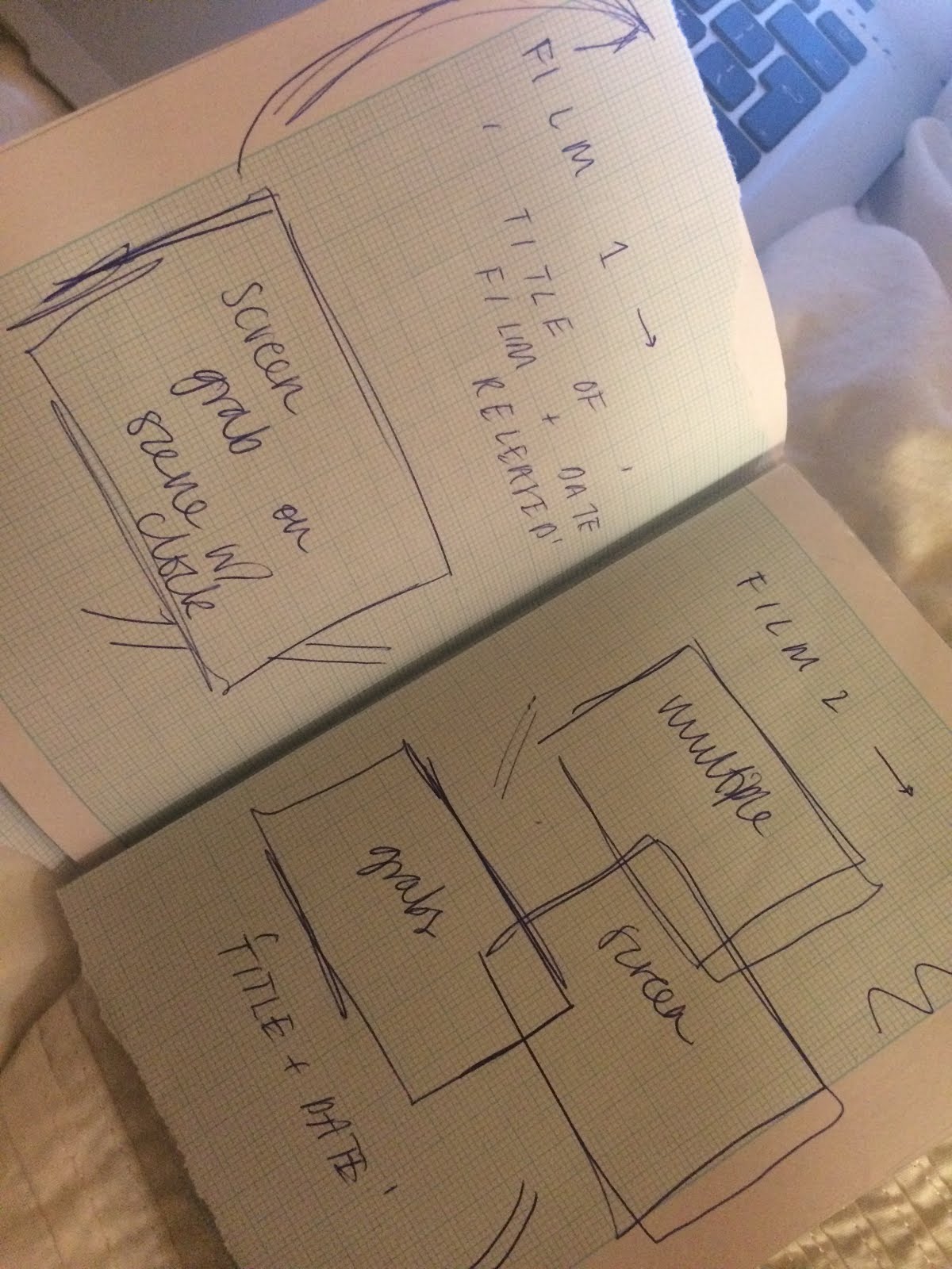
I think my Design Process was better in Brief 1 because I had more time to think, develop and change my ideas. Another thing that aided my in that brief was the feedback that I received, due to the fact that it was quite a strong idea my group had lots of feedback each time for me with new ideas for me to play around with. Studio brief 2 I believed suffered in my case because by the time we were starting to develop our ideas for brief 2 I was still working on my outcomes of brief 1 to make it the best that it could be. In hind sight I should have thought about this prior to getting set brief 2.  I should have spent more time on the process and done more mock up designs to help with my feedback. I have enjoyed doing both of these briefs but there definitely are places where I could improve.

During this module I have become more conscious of how the process of design effects the outcome and that the process can be more important than the outcome in some cases - if there is no process is the outcome as meaningful? 

I find the group crits extremely helpful for me and is a good learning curve for me because I still am not very good at portraying my thoughts into words and having to do this for the crits is helping me to improve. I have realised how helpful the crits are because you receive so much feedback that you can choose what idea you go with and getting the feedback really does impact on my work.

Overall I think this module was a great start to having design process and general understanding of more conceptual graphics. I defiantly think that my process was a lot better in brief 1 which is good understandable because I spent more time on it. To improve this for the next module I will have to manage my time better.

Wednesday 8 February 2017

SB2 - FINAL OUTCOME ZINE DESIGN + FINAL CRIT


These are the images of my final ZINE design.From the crit I received feedback like : doing it by hand and scanning it in definitely gave off a look that would not be the same if you did it all digitally. I think it was a good design decision to do it by hand - it gives off a rustic look and feel. Doing it by hand may give off a certain look but to me it looks incomplete - maybe to complete it you could add over the top some text on the computer.

SB2 - ZINE RESEARCH


Here I have been looking at other Zine designers and designs that will help me when I am creating my own zine. 


SB2 - DEVELOPMENT

I chose to develop further my 2nd idea, I started researching broadly in the use of clocks in film and TV but there are just so many. One of the first things I came across was a website that had 'the eight best movie clocks'

1. Back to the Future (1985)
2. Metropolis (1927)
3. Safety Last (1923)
4. Hugo (2011)
5. Wild Strawberries (1957)
6. High Noon (1952)
7. The Hudsucker Proxy (1994)
8. The Stranger (1946)

Looking at these movies the only one i recognised was Back to the future so I thought this wouldn't be a good route to go down. Or at least there would be a better route to go down.


I then found a couple of ideas that I thought would go well with this project. I looked back at my initial research I did in christmas and saw that something that I found was clocks featured in disney - there are more than you think there would be to start with.

I also found online this website which was 10 famous movie scenes that show people waking up - Waking up scenes website.

Both of these ideas were something that I thought would be good to develop further. But I looked more into the use of clocks in disney movies. I gathered a few images and the majority of them were movies that weren't produced that recently. Because of this i made the decision to make the booklet / zine sort of vintage style, I wanted it to have a old look to it so I researched into ways that I can achieve this. From my researched I gathered that if I hand created my project and scanned it in to print then it would have a vintage look to it because the scanner can not always be perfect and can have dust on it which would add to my vintage look and feel. These were some images that I found that had the same sort of feel I wanted.


I also decided to use graph paper to give my zine more character and a friendlier feel. I used tape, coloured pens of different thickness and different paper types with patterns to make my zine quite informal. Below are some of the materials I used.

SB2 - GROUP CRIT ON IDEAS


Pitching my ideas to the group really helped me develop my idea further as I wasn't sure if my idea was relevant to Johann Heinrich Pestalozzi's principles when he is teaching. The brief states that we should use his principles of observation and description to develop our project.

I initially thought that my research was not enough but the crit helped me because everyone said it was fine to carry on with the research as I got on and that the research was fine.

1-
For my first idea I couldn't really do a mock up design for it, but I explained my idea and how it related to the excel task we did in christmas and showed some research that I had done to go alongside it. The feedback was good, they said the best thing to do was to do further research into people who do art on excel find the correct colours and just research more in depth. Was also told that should be a series of images rather than just the one to make it more interesting. I was also told that the idea is good but there isn't much margin for error because the images I showed them already looked pixilated so it would be very hard to make it look good aesthetically.

2-
Got a lot of positive feedback from this idea. It was said however due to the fact there are so many scenes where there is a clock or watch on TV and in the movies that I should definitely consider narrowing the idea into a certain theme and be selective when doing so. It was suggested that I also research in the type of sine I want, it could be informative, formal or informal. I need to explore the options. I believe that this is an idea that I would enjoy developing further. Below are a couple of the images I showed roughly to my group with some Tv and Film research alongside it to help them get the visual I was trying to achieve.


3-
My group thought that this idea was ok but not as good as my previous ideas, someone said that it to her is only good in theory. She thought that it would be very hard to actually create this as a document. Also it was pointed out to me that it would not be a very engaging document (however I was not going for an engaging document rather I was going for informative) due to the fact that it only has small pieces of information on each page and the images on each of the pages would be very similar of clocks.


From the crit I gathered that in general not many people liked my last idea in comparison to my other ideas. I personally think I would love to develop ideas 1 and 2 in further detail. I think the one that I can develop the furthest is idea 2. The reason behind this is because I can research into different themes and I think it will just interest me more.

SB2 - INTIAL IDEAS


For this project I knew that I needed to take the objectivity of the clock and make something abstract from it. Make something that makes the audience not just see the object clock but look at my piece as something as a whole.

For all my ideas from this project I wanted to use the research I had done prior to aid me in my work. I started by looking at the abstract nature of the work I did on word and excel to see if I could develop this further into a project.


1 -
Looking back on my excel project and after seeing some of my peers work I thought I could develop my drawings to be more complex and at a larger scale. I could look at the detail that can be used if I make the scale huge and spend time on it. I looked into to see if it had been done before and it has One of the best artists I found was Tatsuo Horiuchi - he only works on excel and the results he gets from this is amazing.


I also looked into some other artists that do this type of work, looking at the scale they use.


In terms of format I could have it as a poster of an image like the one below. 


2-
Looking back at my research another route I could down was the use of clocks in the TV or Film  area. I want to use the research I did maybe take the research a bit further or maybe make more selective theme, maybe something like just analogue clocks in film or something along those lines. For the format of my printing method I think a good route to go along would be a booklet or a zine. 


3-
For my third idea I looked back on my research trying to find something else that I could produce. I saw that I had researched into the Guinness World Records and the records that are held in relation to clocks. There are 260 records when I typed in 'clocks' into the search bar. I was thinking that I could produce a mini flip book sort of thing including all the records that are provided. Each page could include the name of the person who holds the record, what the record is and when the record was set. 


Tuesday 7 February 2017

FINAL POSTER DESIGN EVALUATION

Below is my final design. I chose this design above the others for a couple of reasons. Because the name of the exhibition and the V&A logo are both at the top of the poster this means that when I fold it down into A4 the name will be on one side of the a4 and the logo will be on the flip side. Another reason why I chose this design was the way that your eye is lead as you look at it. Because of the angle of the paper structure and the surrounding lines your eye is lead from the name of the exhibition down to the structure. I think that it works quite well. I also used the outline of the structure and enlarged it to have on just to add some repetition and another aspect that leads your eye down. I started out wanting to reflect the name of the exhibition in the visual aspects of the poster and I think I have succeeded in this because of the colours that I used in the poster. 


SB2 - EXCEL DRAWINGS

I found doing this as an exercise quite time consuming and after doing the word drawings I found this much easier because on excel I found it was much easier to see your drawings as drawings because of the block shapes that you use. After I did them all I thought that doing a drawing on excel was much like a normal photograph or drawing just heavily pixilated.


On excel I tried to look not just only at the clock but the things that make up the clock or things that are used to fix it or along side it - I thought a little more outside the box and tried to push myself further than I did in the last task.

SB2 - OBJECT - CLOCKS


Sundials had been used for timekeeping since Ancient Egypt. Ancient dials were nodus-based with straight hour-lines that indicated unequal hours—also called temporary hours—that varied with the seasons. Every day was divided into 12 equal segments regardless of the time of year; thus, hours were shorter in winter and longer in summer.
The sundial relies on shadows to provide a good estimate of the hour on a sunny day.


The Prague astronomical clock is a medieval astronomical clock located in Prague. An astronomical clock is a clock with special mechanisms and dials to display astronomical information, such as the relative positions of the sun, moon, zodiacal constellations, and sometimes major planets.


FACTS
1. With the invention of the pendulum clock in 1656, Christiaan Huygens increased the best accuracy of clocks from 15 minutes deviation a day to around 15 seconds a day. – Source
2. An Institute in Colorado created a clock so accurate it won’t lose/gain a second in 20 million years. This is the clock used for internet time. – Source
3. Two scientists proved time dilation by each flying around the world (east and west) carrying 4 synchronized atomic clocks. Upon landing, they compared them to atomic clocks they’d left on the ground and found that their clocks were no longer in sync. – Source
4. The Big Ben is the name of the largest of the five bells which hang within the clock and not the name of the landmark clock. – Source
5. Pennies are used to adjust the time in London’s Big Ben clock tower. A single penny can change the pendulum’s center of mass and alter the time by 0.4s per day. – Source
6. Artist Siren Elise Wilhelmsen designed a clock that knits a scarf every year. – Source
7. For those who have trouble sleeping researchers say that 1 week of camping, without electronics resets our biological body clock and synchronizes our melatonin hormones with sunrise and sunset. – Source
8. “o’clock” is a contraction of “stroke of the clock” and comes from 15th century references to medieval mechanical clocks. – Source
9. Clockwise and counterclockwise were originally sunwise and widdershins before clocks were common. – Source
10. When you look at a clock, and the second hand seems to freeze for a moment, your brain is actually generating a false memory, and your perception of time stretches slightly backward. This effect is called chronostasis. – Source


Guiness World Records -->


   Clock types à


Film and TV -


3 famous clocks

1.     Big Ben – London, England – third tallest free-standing clock tower in the world
2.     Philadelphia City Hall, US – 548 feet tall, 4 clock faces on each of its sides – clocks measuring 26 feet in diameter
3.     Makah Royal Clock Tower Hotel, Saudi Arabia – 1,972 feet – world’s largest clock face


A surrealist painter, the Spanish Salvador Dali is one of the most enigmatic artists of the twentieth century. Known for his weird and outlandish subject matter, Dali's most famous work of art is probably The Persistence of Memory (1931), often called just "Clocks" and widely regarded as a Surrealist masterpiece.


Clocks in Adverts -