I chose to take 2 of my sketches forward into the development of the design of my book cover. I chose the plasters quote and also the rose garden quote. The reason I did not take the bubbles one which was related to the floating quote was that I wanted to use illustration in my designs and I found it very difficult to get a good illustration of a bubble plus I believe the other 2 quotes had a better concept behind it. Due to the current book covers having a very monochrome style I chose to infuse more colour into the designs.
1 "They didnt sell pink plasters. Only dark brown ones"
Here I used a hand drawn image which I scanned in and image traced on illustrator to gather the main plaster shape of which I then multiplied to have this effect. I like the way it lookes close up as shown above
Here I then experimented with the pink type on top. This type was hand written by myself and I maed it quite large because I the brief says to have bold typography.
Here i experiemented with doing it all digitally but I personally think it is too rigid and doesnt respond to the brief in the correct way. It was said in a small critique that the covers above seem :
- too busy
- maybe add a some pink plasters to the hand drawn one and try a different title
- the title on both dont really work seems too busy and a bit unproffessional
- the concept from the quote is good
From this mini crit I think this is as far as this design is going to go as it is not as clear and proffessional as my other design.
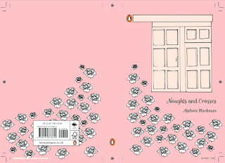
2. "He's down there in the rose garden, just below my window. I can sense it. I can sense him." I think this is the quote I like the most as when I first started researching into this book I forgot that it was really a book all about young love. I just remembered it as the book al about racism however I dont believe this is true as it is a love story.
Here I hand drew then scanned in the window image and I hand drew a rose which I then edited on illustrator and simply used the same image however for some of them I flipped it so there was a bit of differentiation between all the roses on the page.
Once I was happy with the layout of my design I then started to play around with the type that I wanted to take to my final crit for this brief. I think that this cover is definately my strongest one which i will send off for the competition.
Above right use of hand written type is along the right lines but doesn't quite look right with the rest of the cover. Because of this I tried out many different type including ones shown below.
I dont think the above ones work as well so then I tried some more and came up with the ones below :
The last image on the right ^ is the one I will take to my final crit as I believe that it is the strongest design which has the strong concept relating to the quote behind it. I also think the hand written type by myself is a key addition due to the brief stating that it should have strong typography element. It was said in my small critique that the use of handwritten type is strong but is also not over powering to the rest of the cover so it works well as a whole. It was also said that the last image on the right is also the best because of the shading.
I then looked at the text that need to be included on the back of the cover and originally looked at a number of types I know well (like the right cover) however I realised that none of them worked as well as I would want them to because I handwrote the type for the title so I would need a handwritten type to inkeep with the theme of the cover. I chose one called 'Shark Handwritten' from a number of handwritten types as I thought it was most like my own handwritten title.


No comments:
Post a Comment