
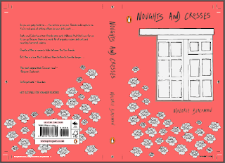
This is the design I chose to take to my final crit the response from my crit was :
- great concept
- maybe try with a different colour scheme as it may look too girlie because of aspects like the hand written curly type or the illustrations of the roses
- could be more eye catching - again could be linked to the colour scheme - try something bolder?
- as a whole the cover works well and has a strong theme throughout
- i like the simplicity of the hand drawn cover
- the white of the roses / window could be a little too harsh - try cream instead
- the curvature of the roses and the type works well together
- the title seems a little too close to the top - try moving it down
- is there a reason it is pink? justify it if there is
Improvements:


Above I changed the background colour to something more vibrant and changed the colours of the window and roses becuase of the feeback I got, I went with a more grey tone instead of cream because I thought it was more inkeeping with the theme of racism which I thought I could portray a little bit.
I then looked more into the background colour to do this I looked at Blackman's previous book covers and found this :


From this I thought I could use these 4 colours and see which would work the best with my design as show below :


I looked at all the 4 colours and thought that the yellow was the best because I think yellow represents loyalty and I think that is a strong theme in the book because Stepy and Callum are loyal to each other throughout the book even though they are not meant to be together.
No comments:
Post a Comment