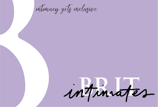
After the initial business card development the client was happy with the 'B' to be used in a subtle way to hint at what the brand is selling:
Monday, 29 April 2019
Website client meeting and further development
Above was the chosen website design by the client, showing a slick and very modern design, being minimalistic creates an inclusive looking brand which is what the client was aiming to do and be. As desired the client was pleased as the design was very clean cut with soft elements coming through from aspects such as the type.
Above is the shop page, i think the style of this page is more appealing to millenials as it is very modern whilst still appealing to the client as it gives off a very professional style without doing much at all.
Website mock ups
As I had done the research on the competitors and websites that the client had liked and I have had constant communication, through the different aspects of the design I knew what the client wanted. An example of the design I want to avoid that is one of the client's competitors is. The reason I do not like this design and the client does not like it is because it is very cluttered and the client's eye is thrown all over the place. I think my designs need to be more subtle and sharp :
I designed three different mock ups for her website (using not my own images - just as I had no content yet from the client) :
I designed three different mock ups for her website (using not my own images - just as I had no content yet from the client) :
The first of my mockup designs is very generic and clean design appealing to all ages as it is easily read and clear. The structure gives the design a sense of authority and clarity.
The next design was loosly based on the VS website with the simple panel design which outlines and gives definition to the images and text on the page. Again showing here that simplicity in the design is key to create a slick and well thought out design. This design also adds more colour which could appeal to the target audience.
The last of my mockup designs is where I thought about the audience being millennials so I would need a more modern and fun look to the website that created a sense of interest that would keep their attention for a longer period of time. Thus making the audience want to go to the next page.
I think this was achieved well giving minimal information thus enticing the audience. I will take all three of the designs to the client to gather feedback and go forward from this.
Business cards initial designs (front)
Initially, when designing the business cards I decided to start simple and clean as was specified in the brief. However, they did not give off anything and I think are a little too minimalistic and a touch boring. Due to the logo being a white background I thought it would be interesting to change it up a little and use the main colour in the branding as the background. This gave it a fun sense however was unsure if it was giving off the sophisticated look that was desired.
To go further I think the best thing to do was to use all three colour to experiment with in every aspect. Looking ta placement and how the different dimensions work as a whole in a way that compliments each other.
One aspect that could be included in the business card design (however could potentially be moved to the back of te business card if necessary is the slogan that I came up with "intimacy gets inclusive" referring to how the client is perceiving her brand to be - about intimacy as it is a lingerie shop which is trying to be inclusive for larger breasted ladies as a lot of lingerie is not sexy when you have larger boobs - its all about the comfort.
Business cards ideas / client discussion
Going forward from this I am going to take a very minimalist approach and refer back to my designs for the logo development. I don't think I will refer back to the research that I did into the business cards as I don't think that it will be suitable for my brief.
An idea I did have and will suggest is that could be embossed and leave that up to the client, ask I think this could be something that she and her brand would like and benefit from. The reasoning behind this was in relation to the 'intimates' aspect. As I have intertwined the two texts for 'BRIT' and intimates I thought I could take this further by mimicking the sense of intimacy that you have by embossing or debossing, giving the card another dimension and as intimacy is all about feeling it gives the card an aspect for the viewer to feel and touch.
In relation to the design I will stick to the colour scheme chosen from the logo development of white, black and the purple pastel colour.
The client initially seemed intrigued by this idea, I showed her some examples of what sort of thing I want thinking of :
From this she seemed a little unsure however suggested that I create the design just plain for now to see the vibe that it would be then that could be tried after.
i am going to design the cards in mind of embossing the card as I think it only furthers and creates a fun new dimension to her brand that represents what the brand stands for.
I suggested to the client that I design round edge business cards as they are more feminine and playful which was an idea that she loved.
Subscribe to:
Comments (Atom)


