Looking back at my initial design ideas I asked some peers what they thought on the four designs:
- the font does not match the logo
- everything does not flow as one
- looks a bit too basic
- the circle might be better if it is standing on its own without the required text in it
- is not eye catching enough for a degree poster
I then decided the best thing for me to do next would be to refer back to the client and see if I could gather some more information on the topic. If there is more information about the name or the exhibition as a whole I would be able to do some more topic specific research which would benefit my designs.
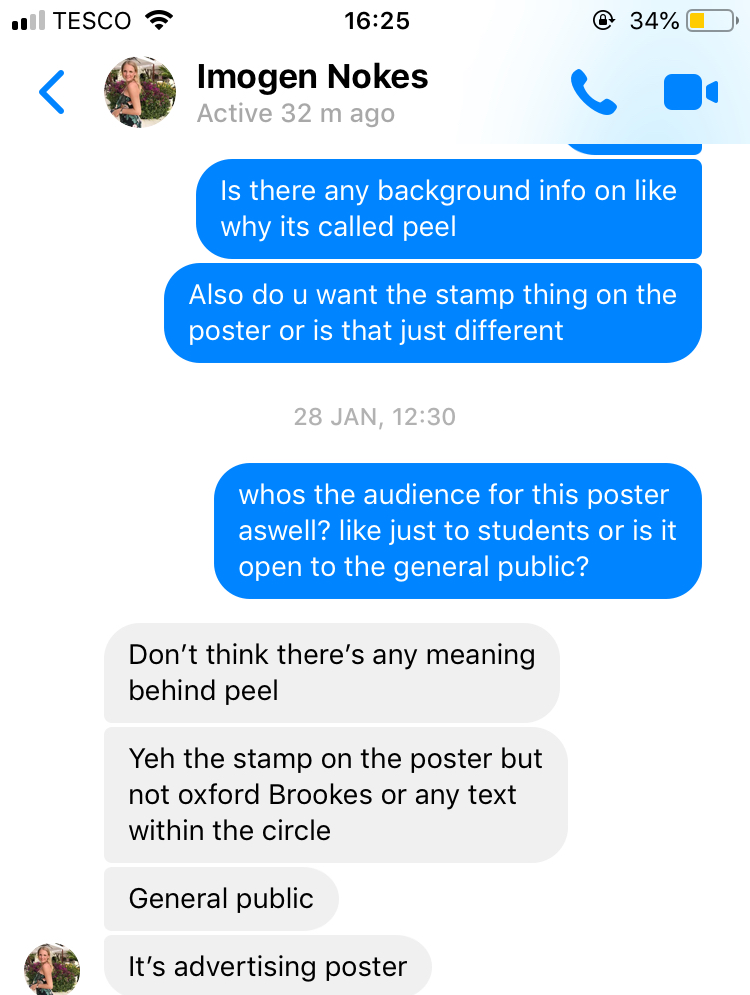
However after getting in contact with the client again it became clear that the name was picked by the Fine Art degree students and they had not given a thought to the meaning or background that is key for a degree show. A key theme needs to run through all aspects of the degree show to make the branding run as a whole, the name is the first thing you tell someone about a degree show, the name and what it is about.
After asking about the name a couple of times I thought it best to leave it as the client had asked her class mates and they said they picked the name for no specific reason they just liked it. I decided I would not let this affect my design process and refer back to other degree posters to inform my designs.

No comments:
Post a Comment