Tuesday, 31 October 2017

DESIGN FOR SCREEN FURTHER RESEARCH


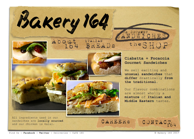
Because of the feedback we received to make sure our app doesn't become corporate because Bakery 164 is so authentic and unique we need to have that represented in our app. Because of this I did some further research into small / not chain bakery's and cafes. However there were no apps I could find for my research so looked at the next best thing, websites. As shown below. 


To keep the app authentic and original to Bakery 164 we need to keep the colour scheme, typeface and the general look and feel of the shop represented throughout the app, I took a couple of photographs to just get a little feel for the shop, as shown below. 


As customers of the sandwich shop, we known that it is known for its authenticity. This is shown in the handwritten signs in the shop window and on the labels themselves, old fashion fridges and the dated wooden surfaces. The main purpose and focus of Bakery 164 is to provide Gourmet sandwiches at lunchtime and thus do not spend large amounts of money on their branding / decorations inside the shop. We believe that this is all part of their identity and authenticity, which is something that we are going to portray in our app. We want to digitalise the activity of buying sandwiches from Bakery whilst keeping their identity to show what we love them for.


In order to find out what students think about bakery 164 we conducted primary research by asking peers the following questions :

What comes to mind what we say Bakery 164?
- legendary sandwhiches
- angry man shouting numbers at you
- organised chaos
- funky tunes
- crowds of people, queues outside

What is your normal order from bakery 164?
- a sandwich and a latte
- just a toasted sandwhich
- sandwich and crisps
- toasted sandwhich
- pizza slice - they are underrated!
- toasted sandwich

After gathering this information it gave us an indication of the main aspects that we should consider in the design, as well as thinking about the user's experience of our app. It is important that there are clear inks and associations with our app and the actual experience of being in the store, so that this is still what people associate with when they are using our app.

Saturday, 28 October 2017

DESIGN FOR SCREEN SPECIFIC RESEARCH

LS6 have just had a refurbishment and have changed to a more modern approach on their social media. They juxtapose stretched images with the negative space which is showing a big different between the visual aspect and the information they want to be showing to their customers. This means the images need to be visually stimulating and show the cafe in a positive light to have more customers. They have chosen a sans serif typeface that is easily read and makes the aesthetic of the website more modern. There is a strong sense of identity and a consistency throughout the imagery and type which keeps the simplicity. 


oranaise Cafe is a moroccan and mediterranean cafe which is representing the culture and experience of dining in the restaurant. They portray this through the colours and patterns used in the design. Although the website is a bit busy it is keeping their restaurant authentic and exciting for the viewer showing them what they are about.


Friday, 27 October 2017

DESIGN FOR SCREEN BRIEF

THE CLIENT


Bakery 164


THE PROBLEM


Overcrowding in the shop, which causes long queues and frustration within the lunch hours. Cash only.


THE TARGET AUDIENCE


The target audience would be aimed primarily towards students and also local sandwich enthusiasts.


THE OVERARCHING AIM OF THE PROJECT


Create an app for the gourmet sandwich shop, Bakery 164 which includes the following ; allowing customers to pre order, find out information about the products, create a reward system which boosts brand loyalty, make your own sandwich suggestions, find out about the latest events and keeps Bakery 164 in the current trend of digital marketing. The design should be simple, professional and maintain the current brand elements. The user-friendly, quick and easy interface will save a lot of time for both the student and shop to improve the efficiency of the business. The overall goal is to create an enjoyable experience for the user whilst advancing business.


Showing Dom our brief she said -


Make sure you don't make it corporate, keep it authentic to bakery 164 - the atmosphere makes 164 what it is so don't take that away with a chain like app like the ones you have researched already.

DESIGN FOR SCREEN INITIAL RESEARCH


Georgia and I printed these out so we could analyse them to see what we liked and disliked about these apps that we thought were relevant to our own project. The analysis is shown below in the pictures. 


DESIGN FOR SCREEN USER EXPERIENCE

User Experience is everything that effects the users interaction with a product, user needs meets business needs. Follows user centred design process, take users need into account at every stage. Its the design behind the visuals.

It is the way people interact with a digital system, usability refers to the ease of use. Efficiency by which a user operates a system. Interaction design is then the organisation and construction of interactive elements.


User experience asks about the emotional impact on the audience, engagement, happy with processes, does it fulfil the needs of the audience. About individuals and subjectivity and how the individual is absorb by the process. It should be the main focus when designing. 

User Experience Design
Iteration, verifying and refining to ensure design is the best it can be


Analyse- research
- data analysis 
- conceptualisation 

Design
- creating concepts 
- interaction behaviours 
- look an feel 

Prototypes
- realising design alternatives
- how will someone engage with the layout/design 

Evaluate
- verifying 
- refining 


User Research looks to gain a better understanding of the needs of users through the use of interviews, observations and focus groups by identifying and conceptualising user roles, needs, task flow.


Personas
characteristics of archetypal users, fictitious profiles of potential users. Personas encompass a number of different people in one in order to help solve problems and identity needs. 
- reflect on data found
- focus on the present
- be realistic
- describe challenging target audience 
- provide insight into the users context, behaviours, attitudes, needs, challenges, occupation, goals and motivations  


Task flows/user flows
visualises the stages involved when completing certain tasks or the journey a user takes through a system. series of actions a user takes, such as when logging into a website. 
- Goal, 3 stages of task flow simple and efficient (Apple) 

Wire Frames:
- First step towards putting all the user research, personas, workflows etc, into a visual format
- Aim of wireframes is to experiment and test hierarchies and informed layout strategies. UX design designers will always refer back to personas to test the wireframe layout.
- The wireframes can be fairly simple and generals, using placeholders to suggest where the images and text could be placed etc. 

DESIGN FOR SCREEN INITIAL IDEAS


Looking at my 3 different ideas I thought the Bakery 164 app would be the most fun. I am doing this project with Georgia, we came up with the list of aspects to include in the app as shown above. 


Monday, 23 October 2017

ONLY - MATTHEW TWEDDLE

Only is an award winning branding agency helping organisations to use design and grow, based in Manchester. They work with people both nationally and internationally. Work with a lot of non profit, entertainment and education such as :
- Sony
- Goldsmiths
- Design council 
- Festivals

Design for screen – shouldn’t be seen as a limiting fact, see it as a different media for your ideas. It is constantly evolving, fast passed and there are endless opportunities in design for screen. Technology will constantly change how we design so you must embrace the technology and the changes that come with that.

Design Process – 
  1. Research - look at competitors, understand the target audience, personas (who the ppl using it are and what they want from the project), come up with 5/6 principles that sit alongside the brief
  2. Wireframing - collaborative part of the project, get everyones ideas down, basic way to map out fundamentality of your project, test assumptions, and client buy in so they can see what they will be getting before the end product
  3. Design - take the sketches and ideas and start designing
  4. Front end 

Case Study – 

Goldsmiths University 

- Wireframes useful for understanding how the site will work
- needed to promote other courses and attract international students as art course was very oversubscribe
needed to access content quickly


Printworks

- consider how you can bring branding to life of screen 
- print work never got turned off when in use resulting in a constantly evolving typeface to be used across all branding 


Lost Village

- abandoned territory lost in time, informed all branding 
- bespoke typeface based on symbols informed by past times 
- not a traditional website, very informed by the event itself 

Bring me the Horizon

- got 2 weeks to create something online to promote there new album
- created a timeline of content as band wouldn't update the site, bring together all aspects of social media 
- determined by location 


Q&A

-work on 2 large projects and 2 smaller projects at a time 
- tend not to pitch, companies tend to come to them 
- Design at:
– 1800 pixels
– 1300 pixels 
– 768 pixels
– 320/640 pixels 
- Invision- used for prototypes 
- research and wire framing are very important 
- check on developers regularly, design is handed over and developers produce/code

DESIGN FOR SCREEN SB2 BRIEF

STUDIO BRIEF 2

Some sort of digital user face 

Need to write a brief, identify client, problem, target audience, themes for project. This could include :
- website
- app
- streaming service
- in car interface 

Things to consider :
- what kind of digital experience ppl engage with that fulfil their needs
- must be global scale  
- what the user expects to be doing
- consider the reach of the application
- variety of mixed media
- focus on experience factors of the user

Must identify a problem and produce a response to solve that problem. 

Examples:
BMW car key app: user experience
- go to car
- use phone  
- unlock phone 
- use fingerprint or code to open phone 
- close existing apps 
- find app 
- tap icon 
- tap to unlock 
- side and physically open car 

Compared with taping a button on your car key, has not really solved the issue. This is showing that there is no need to overcomplicate the task. 

All about User Experience 

Screen based : Computers, TV, Mobile Phones, Sat Navs, HUD’s, Projections


THINK ABOUT A PROBLEM THAT YOU CAN SOLVE THROUGH SCREEN BASED DESIGN

Areas to explore :
- Website for someone that needs one
- An app for a problem that is occurring

Saturday, 21 October 2017

CRIT

In order to gain feedback on my design I asked the following questions in a peer-to-peer feedback session. I wanted to gain effective feedback on if the publication works well as a whole. I asked these questions below :

How would you bind this publication and why -
- prefect binding would work however might be difficult with the different page types / stocks

- look into other guidebooks to see how they are bound
- staples could work with perfect bind

Do you think it is too minimalistic? -
- minimalistic is good in this sense as that is the basis of the whole book

- could add some more colour throughout
- maybe a little but i think when bound the use of different paper will make it look good

Do you think it will work well as a whole? - 
- yes all relates to your original ideas
- can't tell as not bound

Overall I believe this feedback was helpful and effective, it has made me think that the publication will work well as a whole. I don't think perfect binding would be appropriate for my publication because the writing pages are going to be smaller so I would rather stitch it knowing that they will definitely be bound. 

Friday, 20 October 2017

BINDING


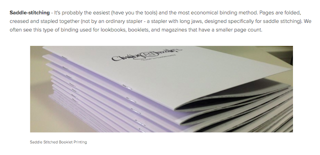
My original idea was to do a section sew, however it would not logistically work due to the little writing pages that I have included. Due to this I am going to use saddle stitch.


STOCK AND TYPE CHOICES

Front sleeve - For my front cover I needed thick enough card for the magnets to stick on without weighing the paper down, however I wanted it to be as thin as possible because it is a guidebook which is going to be used a lot whilst you are walking around the area. Therefore you do not want the guidebook to be too heavy hence why I did not want a hardback cover. So I used a3 thin card and trimmed it down.

Photo pages - For these main pages I used ecological paper. I looked at all the different options and I chose this one because it was the most appropriate for my project because Letchworth cares about the environment - in the publication it says  'only one tree was felled and areas of land were left untouched as a devotion to agriculture'. 
                           

 Mini writing pages - Because this page was meant to represent the layout of a newspaper I also represented this with the paper, I bought A2 newsprint and carefully cut it up into a4 pieces. I then had to arrange each page to make sure that they matched up for when I bound the publication. Newsprint is good as it is thin and is an accurate representation. 

For all the type my design decision was to use Times New Roman Regular as if to mimic the newspaper print. 

Thursday, 19 October 2017

MOCK UP PUBLICATION

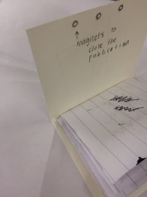
In order to understand how my end result would look I created a mini version of my publication, it also helped me order everything and make sure it would work in indesign so my final product works well together. whilst creating this mini version I thought at the moment my publication has nothing to differentiate and stand out to other guidebooks like it. I wanted to incorporate an aspect that makes it different but that also links back to the concept and ideas of Letchworth. My idea following this was to make a sleeve with the front cover on that was held together by 3 magnets - just like Howard used in the designs, he used the 3 magnets diagram to help summarise the economical, social and political context of his plans. My idea is to have a physical representation of 3 magnets. Below is my mock up, the blank pages are the photographs which are on my LAYOUT blog post. 

Wednesday, 18 October 2017

COVER IDEAS

I wanted the cover to represent everything that I had been looking out throughout my layout designs. It needed to reflect the clean, minimalistic and openness that is needed for my publication. This lead to my developments of a selection of layout designs using the Letchworth coat of arm's colours and imagery that was given to me when starting this brief. 


I started with the 3 magnets idea however the black and white cover is too dull and doesn't represent what I have been looking at. Looking back at my colour considerations I thought I could use those in my designs to reinforce the identity of Letchworth in the front cover because it is the first thing you look at so it needs to portray everything I have been looking at throughout the book to keep the theme the same and to make it look professional. I think the coat of arms photograph is a bit too much and doesn't give the correct sense of space that I am going for so instead I have gone with the last cover design as the cloud and sky in the photograph gives you a good sense of open space and I like the way that it has green trees in front of a building as it is representing the whole idea of a 'garden city'. The spacing in the type is also a bit further apart than normal as I adjusted the kerning to give it some more open space around the letters.