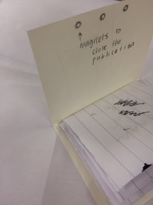
In order to understand how my end result would look I created a mini version of my publication, it also helped me order everything and make sure it would work in indesign so my final product works well together. whilst creating this mini version I thought at the moment my publication has nothing to differentiate and stand out to other guidebooks like it. I wanted to incorporate an aspect that makes it different but that also links back to the concept and ideas of Letchworth. My idea following this was to make a sleeve with the front cover on that was held together by 3 magnets - just like Howard used in the designs, he used the 3 magnets diagram to help summarise the economical, social and political context of his plans. My idea is to have a physical representation of 3 magnets. Below is my mock up, the blank pages are the photographs which are on my LAYOUT blog post.


No comments:
Post a Comment