


Visually looking at the variety of the channels/programmes and the period in time that they were aired was interesting and the main thing that I gathered from the visual research was the intensity and how bold all the different aspects of the design are.
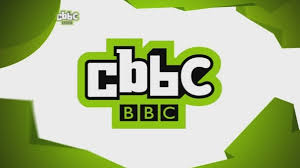
The majority of them include bright colours and an aspect that is aiming to hold the attention of the young audience. For example, the CBBC green 'thing' that is present throughout the initial idents is never staying still - it is always fast and on the move. Which was something that was common through all the children's idents.
Most of the idents are weird and whacky and don't really follow a common script or a set thing like the usual adult idents do. The kids idents allow for a lot more play and fun to be had within them.
No comments:
Post a Comment