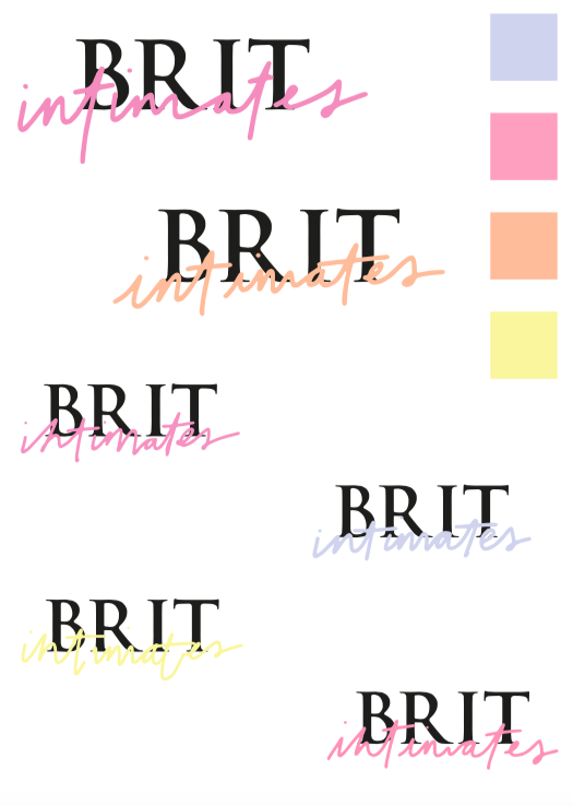
Before interlinking, I decided to look both initially at the 'BRIT' and the 'intimates' to get them to where to client wants before making the logo whole.
With the BRIT I looked at the Kerning with the chosen type. The original type was too close together for the desired look as intertwining would then not look the way I wanted. I also played around with the anchor points as I thought the individual letters were too harsh looking for the desired logo.


Hand lettered type was then experimented with in the style of the handwritten fonts to create a more intimate feel to only strengthen the brand's identity.


I then added the type to go alongside the upper 'BRIT' type to view what it would be like. I will take these further and show the client what I have come up with to see which one she prefers to take forward to intertwine them. I want her to pick her favourite out of the types and the colour palette can come next. this was just initial thoughts on what the colour palette could look like.
No comments:
Post a Comment