


The attention to detail in this packaging is an aspect that is widely liked by the customers. I found a review for an agent provocateur bra and the first thing commented on was the packaging. The found review was talking about how the product was not actually what they wanted and felt very cheap and not well made however in the review she says (as seen below) that the packaging gave you 'the impression of a premium item' and thus reflecting well on the brand. This is the sort of feedback that is wanted, as the packaging and the 'unboxing experience' is something that is very important for this instance.
The fitting notes pamphlet was also praised - I will mention this back to the client to see if this is an aspect that she would also like me to include in the designing phases for her company.

Topshop Packaging -


A good aspect of the Topshop packaging is the clear and strong brand theme running throughout all the packaging. This then makes it clear to customers and anyone of which brand it is. However, when comparing this packaging to agent provocateur is the design. Topshop's is a bit more playful and appealing to potentially a younger audience, being minimalistic and fun. Comparing this then to agent provocateur's packaging which instantly is is a lot sexier with a sense of elegance and femininity represented through the bow on the box.
Asos Packaging -


Asos's packaging is a lot more playful than the rest of the influencers packaging, with an intriguing print. It was commissioned by a Freelance student called Felicity Marshall (as shown below). Her other work is very illustrative and interesting.


When doing further research into ASOS's packaging design, I found that they are very conscious of the materials they are using and how they do produce a lot of waste. They are aiming to become a circular fashion business which is something I greatly admire as my extended essay was all about sustainability in packaging which directly links to this project, which is why I aim to get the client on the same wavelength as ASOS. Sustainability is such an important issue.


Victoria's Secret Packaging -


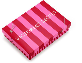
VS focuses on having premium packaging for all their products, having an eye-catching and bold stripe design that is so recognisable. As it is a feminine brand they have gone for the widely thought feminine colour of pink to attract their marketplace. However now, the population are becoming more gender neutral and arent putting colours specifically with a gender. I think it works for VS because it is now such an iconic brand however for the clients company I should try to stay away from this.
One aspect that I have noticed from the influencers packaging is that none of the tissue paper shown is branded, VS is simply just plain pink, and AP is plain black. This is an aspect that I will be developing on to give BRIT intimates an edge and create a strong brand identity throughout. It is similar to with the stickers, they are very simplistic and aren't giving off a sense of sexy or fun or professional they are extremely simplistic - I would even go as far as saying they are too simplistic and a bit boring. You want every aspect of your brand to give off a sense of something your brand represents, in Brittany's case the sexy vibe for larger sized women.
Each package has the logo in large covering a big part of the package. Showing that for this industry I think that is key to have the logo/name present to keep the brand identity running throughout.
Logo Design =

-----------------------------------------------------------------------------------

-----------------------------------------------------------------------------------
Looking at Agent Provocateur, the two founders of the company wanted something for their logo that was different and executed in a way that his competitors could not easily steal. Thus House Industries came up with a flowing Spencerian wordmark as well as a racy and lacy leg logo where they added a touch of pink showing a bodysuit for effect.


-----------------------------------------------------------------------------------


Both the VS logo and the AP logo are more representative of a sexy nature rather than the asos and Topshop logos. This is because asos and topshop are not just lingerie and swimwear companies they are appealing to a wider audience thus showing that the flow and curves of the VS and AP logos are showing that sexiness you need for a lingerie brand.
No comments:
Post a Comment